CAM
PA
IGN
TOUGH
Campaign Design
Infomation Design
Social Justice
Creator
October 2018
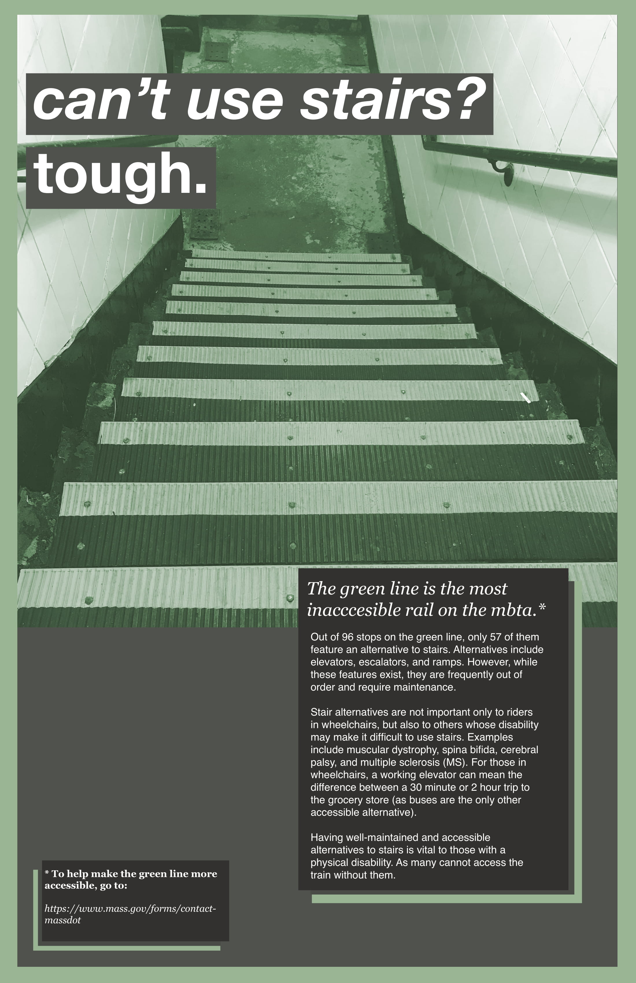
Tough is a social campaign that aims to address the current issue of accessibility on the Green Line of Boston's subway system, the MBTA.
For my Design Processes class, I was asked to create a design intervention for the MBTA. We were given complete freedom over the form of this project, the only exception that our idea must be translated into digital form.I have always been a purveyor of justice for marginalized groups and took this assignment as an opportunity to try designing for social awareness. I was inspired by my late grandfather who, as a double amputee, constantly struggled to use public transportation.
This project started with an exercise that required me to ride the T. The experience map below illustrates my very first experience with Boston's transit system. Growing up close to New York City, I was no stranger to public transportation, however, I have never been in a situation where I needed to independently navigate through public transit. This led to my anxious and frustrating "adventure" on the T.
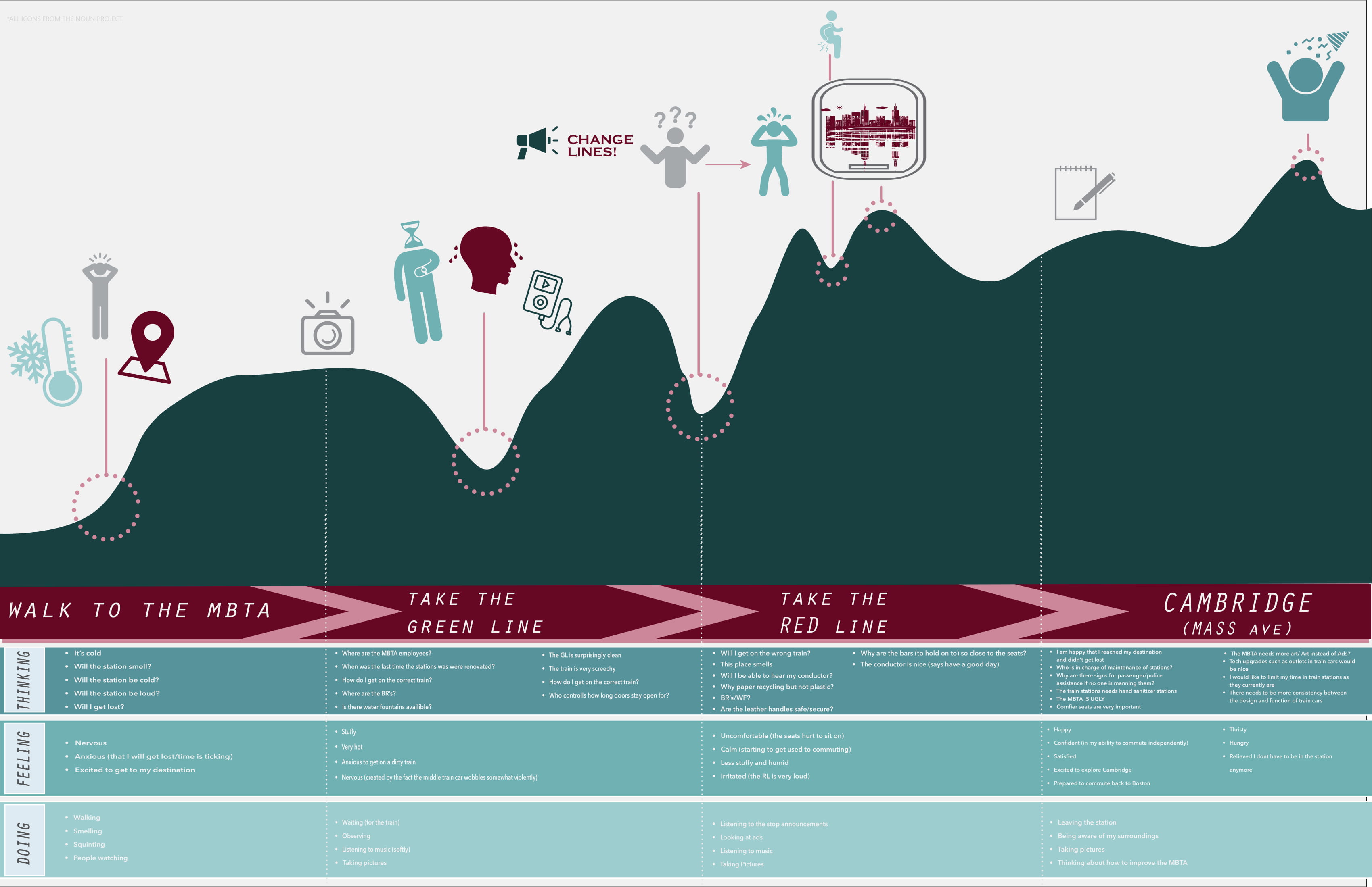
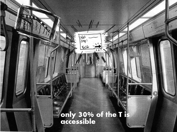
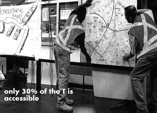
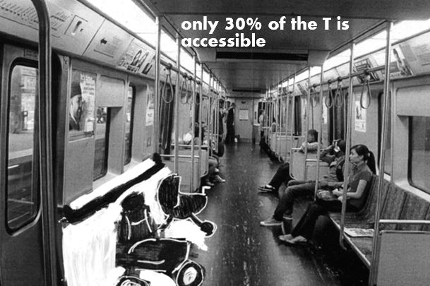
While reflecting on my trip, I realized that the worst parts of my journey came while taking the Green Line, a light rail in the MBTA. In both going to and coming from my desired location, I noticed many inconsistencies and causes for concern within the Green Line. The overall system of the MBTA begged for some kind of design solution but something about the particular tragedy of the Green Line attracted me.
I ended my trip mentally exhausted and wondering if anyone could navigate this mess every day. I mean, I have two (mostly) working eyes, arms, and legs but still managed to get lost at one point. Which made me wonder: how would someone who isn't able-bodied tackle a trip on the T?
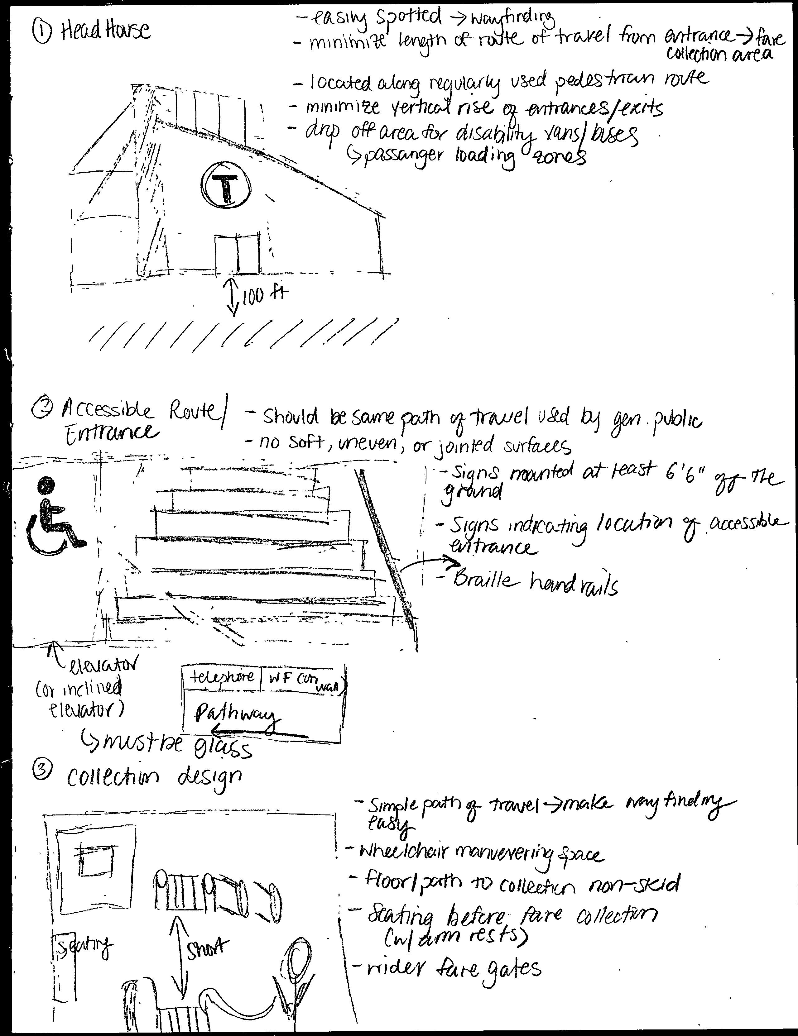
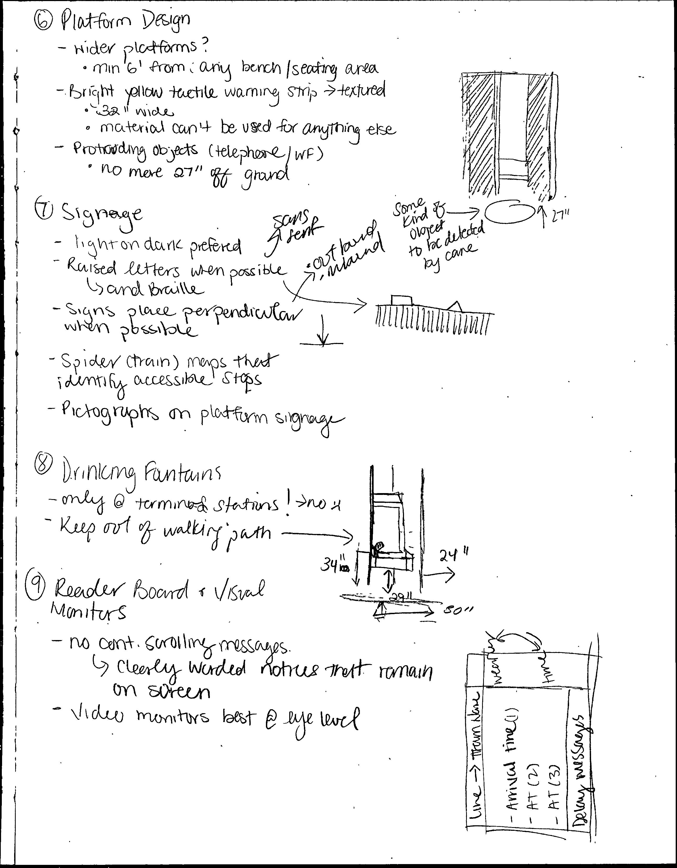
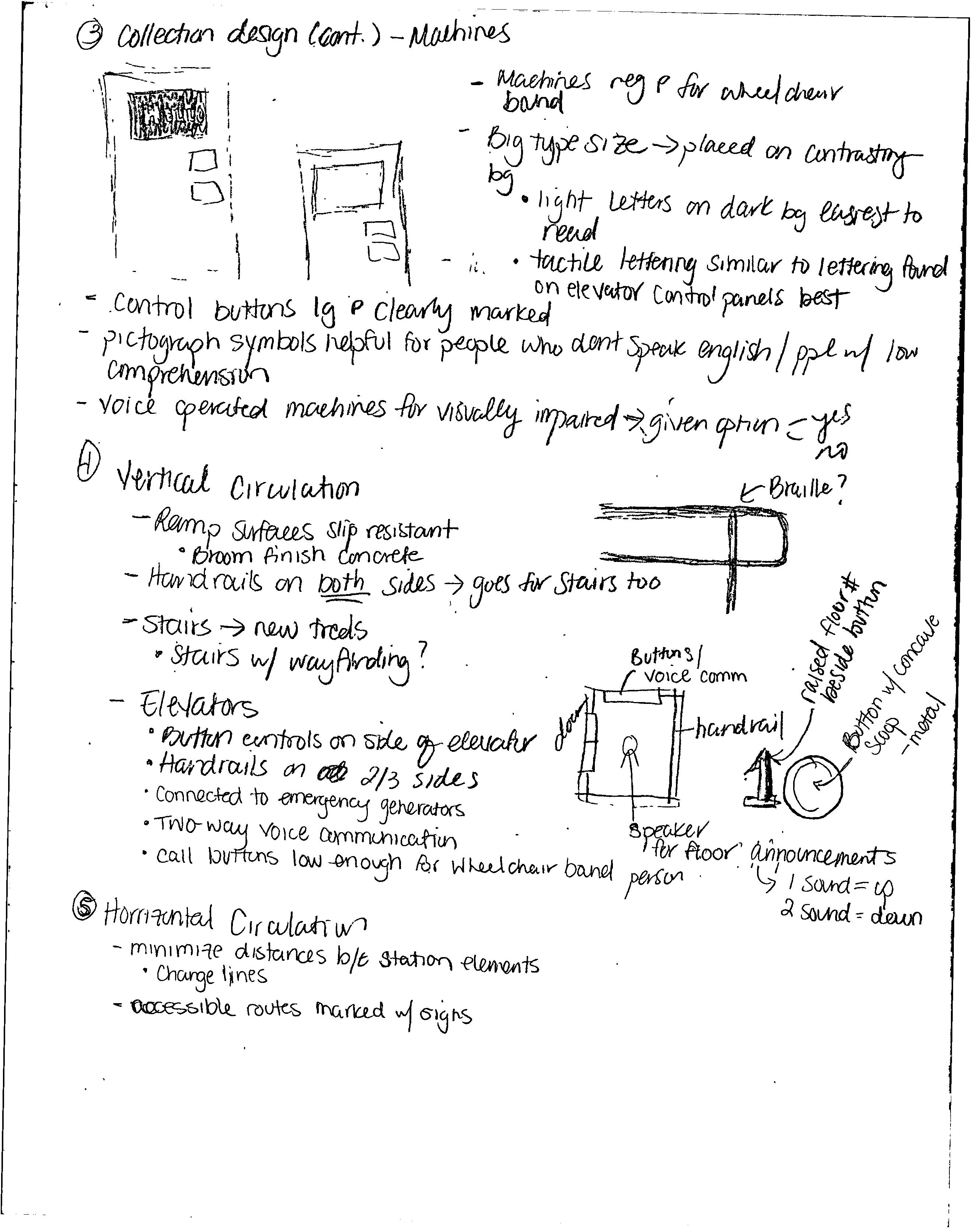
During my research, I came across a design guide by the Adaptive Environments Center, specifically created for the MBTA to create barrier-free transportation facilities. Most of my initial ideas for a campaign series illustrating the solutions to various accessibility problems in the Green Line came from this document, as well as transit systems in other cities such as Hong Kong, Los Angeles, and Washington D.C.
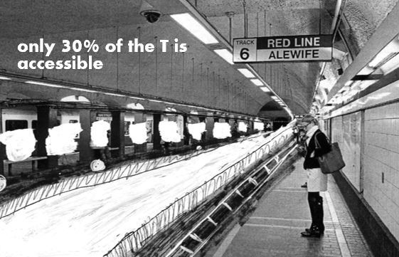
In my first iteration of my campaign, I aimed to combine the organic and blank feeling of my sketches with the dreary and archaic feeling of black and white photos. I used white out and micron pen over printed online images (edited to be black and white) of the MBTA to illustrate what an inclusive and accessible transit system could look like. I chose Aharoni as my headline font for its boldness.
Inspired by campaigns such as Amnesty International's "It's Not Happening Here, but It's Happening Now" and the ADA's "For Some It's Mt. Everest," my goal was to use a short and punchy headline with powerful imagery to send a message about accessibility on the T.
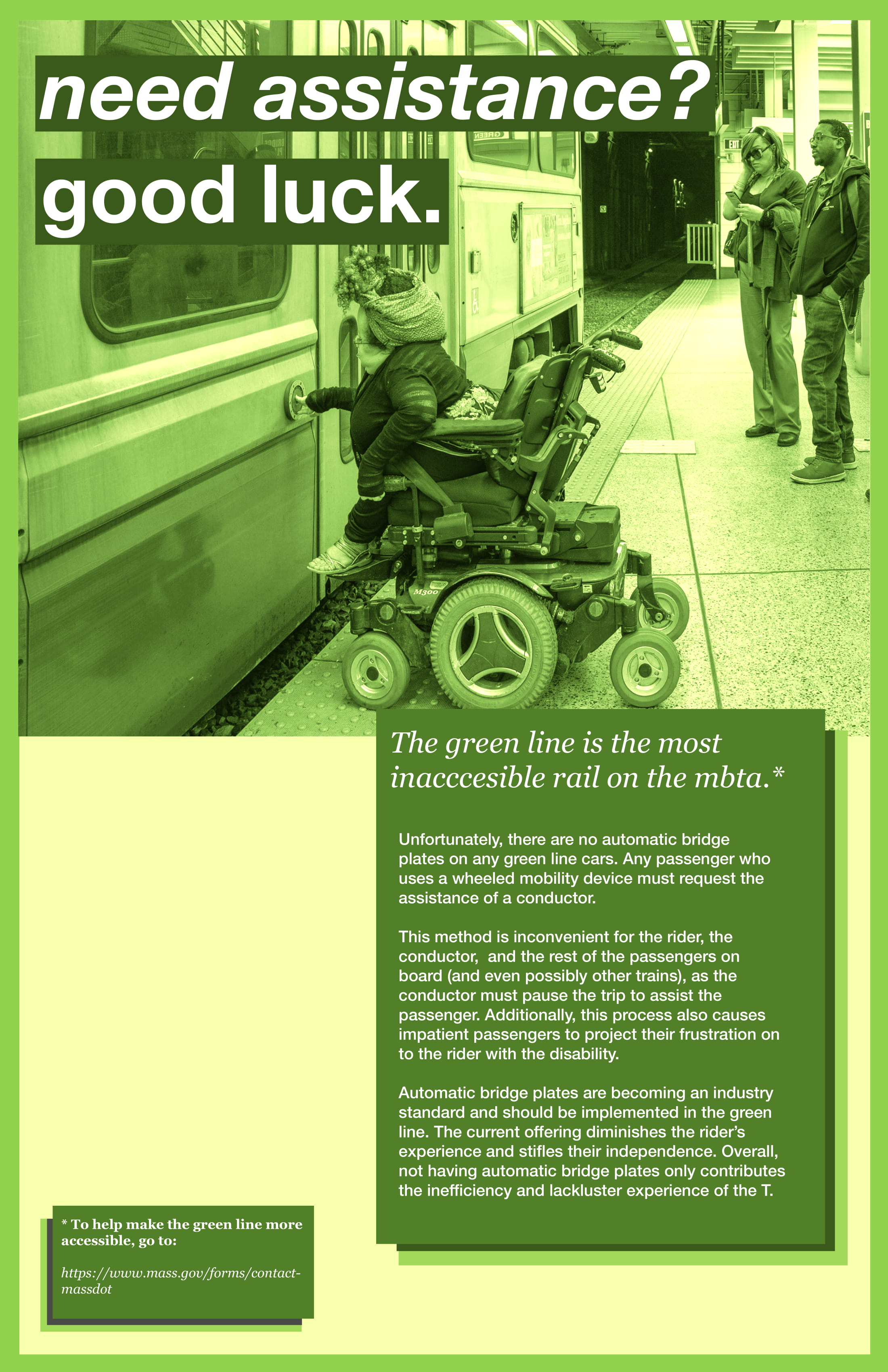
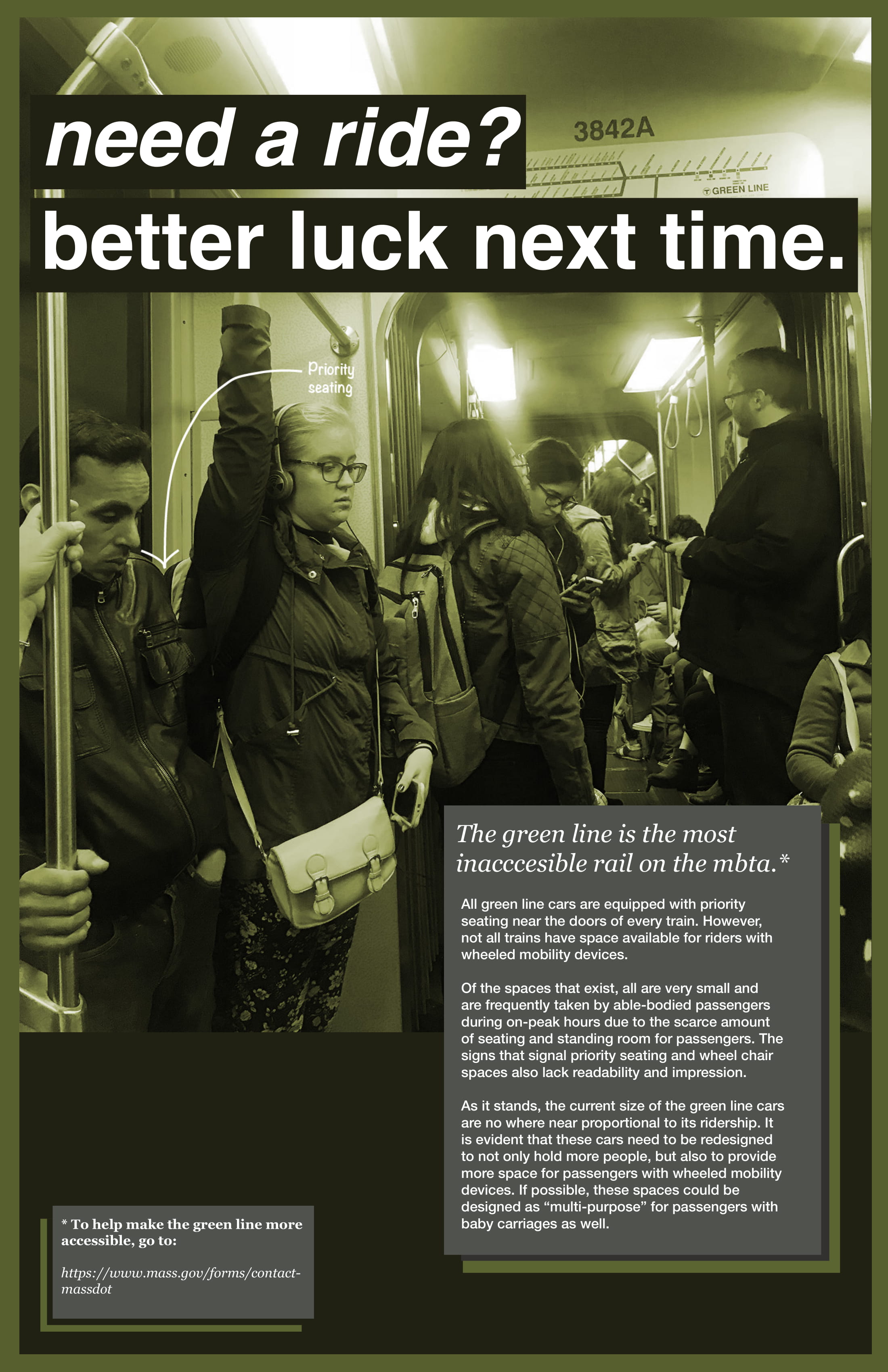
As I began to develop this project further, I struggled to convey my message and show the solution simultaneously. When I revisited the campaigns I admired so much I realized they both focused on a call to action, rather than showing the solution. Due to the time constraint of this project, I decided to refine my scope to the Green Line and chose to focus on calling out specific examples of inaccessibility.
Pairing bold text with mono-toned images, I aimed to catch the audience's attention with my tongue-in-cheek catch lines which reflect what I feel is the message that the MBTA sends to the disabled community through their lack of inaccessible stations. All photos were taken by me.
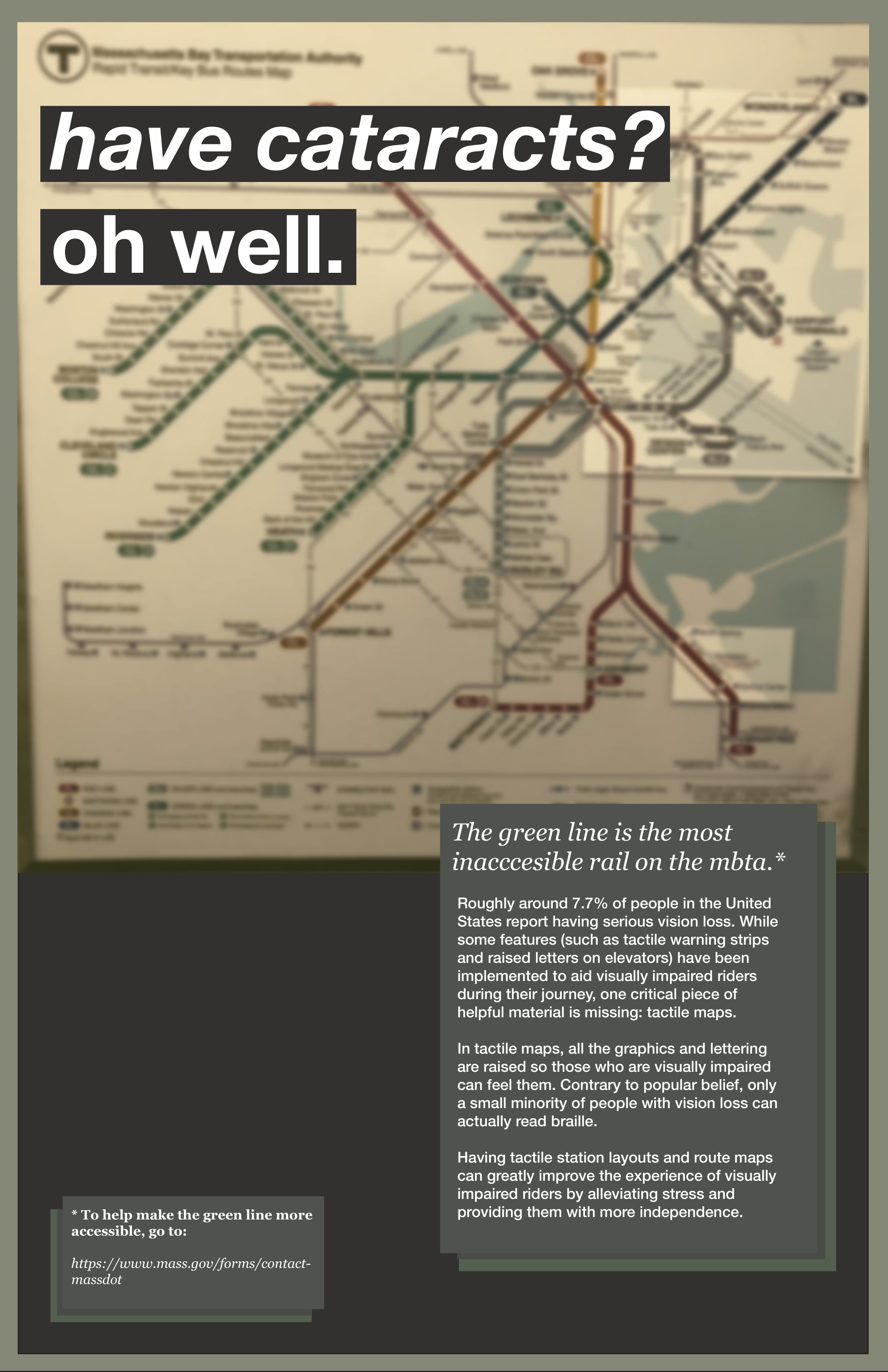
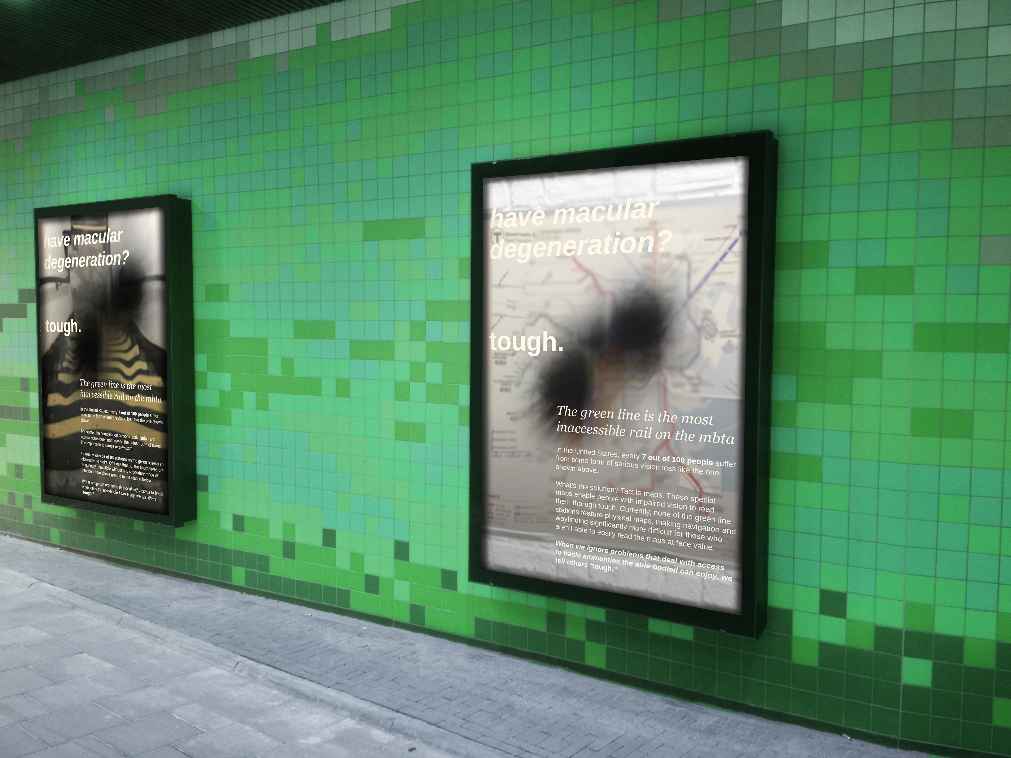
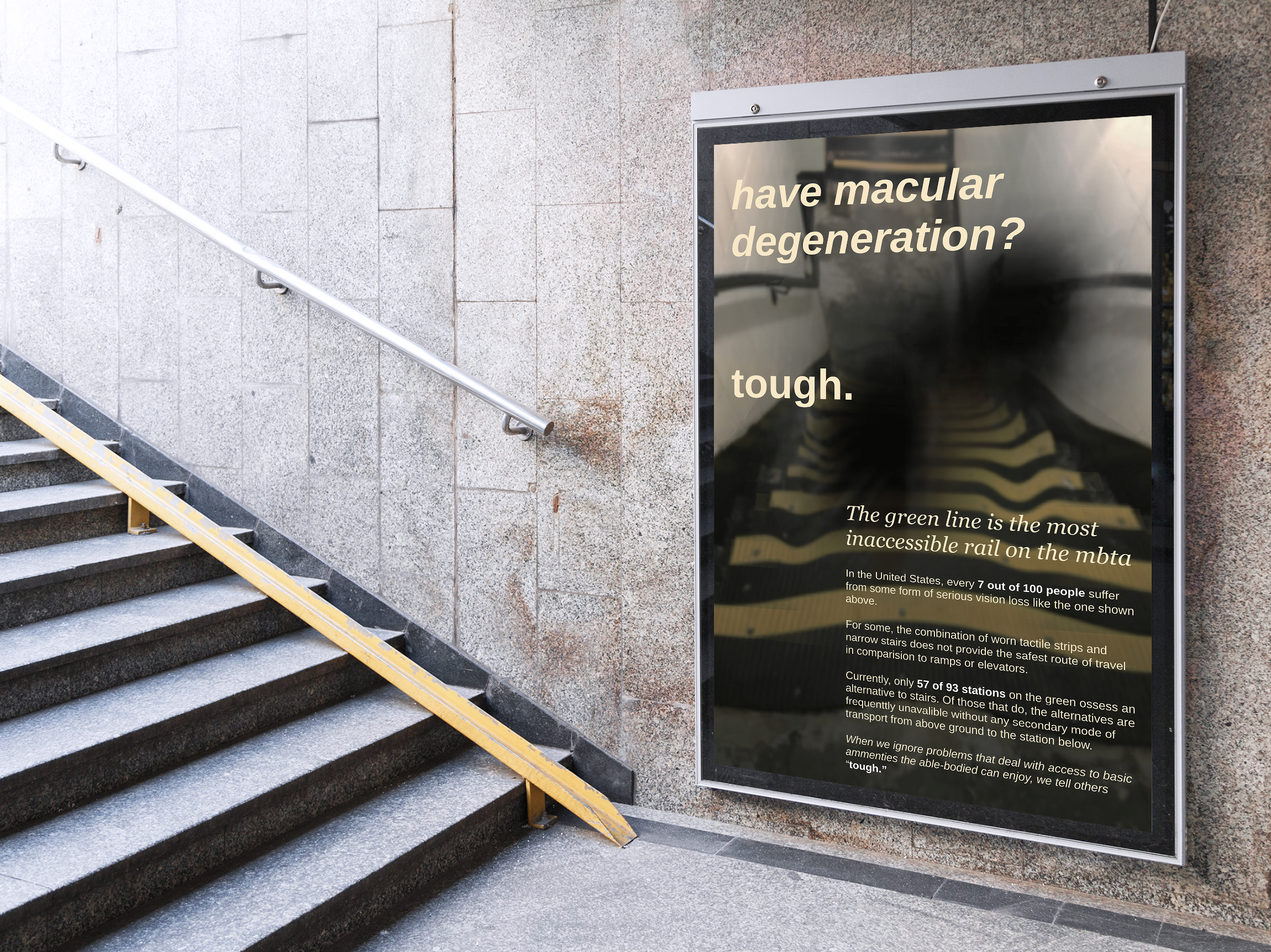
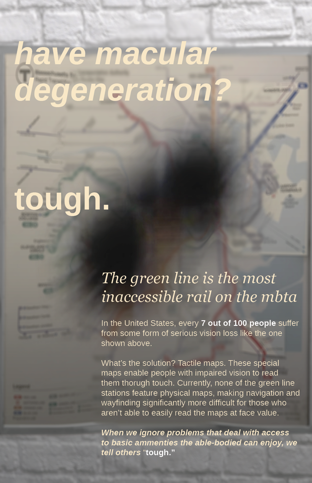
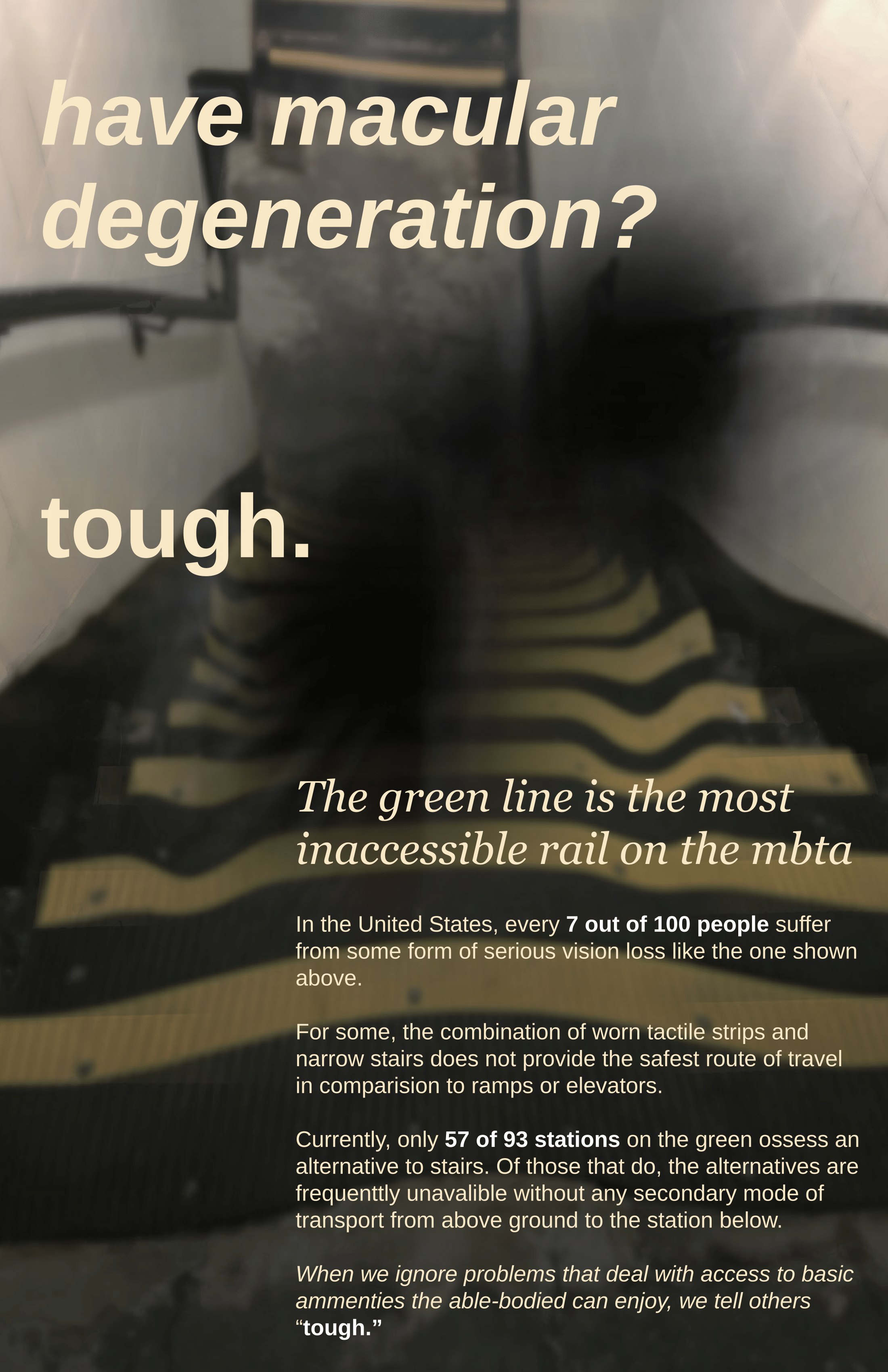
In the second poster discussing vision loss, I aimed to replicate what the MBTA map would look like to a person with cataracts, in order to advocate for the installation of tactile maps. The various dreary tones of green serve as a nod to not only the green line but to the feelings of anxiousness and frustration one might feel while being disabled and trying to take the train.
I used Helvetica Bold to communicate my blunt message about inaccessibility. Georgia was used as a compliment to the headline font, and to bring a sense of authority and seriousness to the work.
Having my second round of designs critiqued by my professor and peers was an obvious lesson in “less is more”. I decided my use of green in my previous posters was not only unpleasant, but also distracting and too literal. Instead, I chose to keep the color in the original photos as natural as possible, making slight adjustments in photoshop to improve lighting and quality. In theory, these posters would be displayed in the station waiting areas on digital triptychs.
Keeping my environment and audience in mind, I greatly reduced the amount of text in each poster and also removed the call to action, which I felt was a tad too aggressive. I also removed the solid blocks of color, and instead darkened the background images of my posters to allow text to lay on top while also being readable.
While my two prototype posters only show the experience associated with vision loss, if further developed, I would have multiple series of posters that focus on the experience of a person with other disabilities that relate to mobility and cognitive abilities.
