DIR
ECT
ION
NUWIT
Brand Development
Marketing Design
Print Design
Design Chair
May 2019 – Present
Empowering womxn in tech through design, one instagram post at a time.
I currently serve the design chair for Northeastern Women in Tech (NUWIT) and oversee all things design. Besides being a passionate advocate of diversity in tech, I was motivated to run for this position in order to strengthen my design skills, gain leadership experience, and boot engagement + member retention through my work for the organization.
At our very first internal meeting, the e-board and I created a list of action items and goals for the year. My to-dos included creating recruitment materials, event collateral, merchandise designs, and a design system for the organization. As for my goal, I first aimed to increase user engagement on our social media, peak interest for our social events, and retain members (new and old) through these tasks.
Secondly, I planned to spend time developing NUWIT’s brand and creating an official design system + brand book that could be used by future design and web chairs. After spending a semester working as a developer for Scout, I was inspired to create something similar (albeit more simple) for NUWIT. As we continue to grow, having a guidelines to inform future design-related activities will be important for distinguishing and promoting the organization.
My first self-assigned task as design chair was to revamp our logo. The original design was good, but I believed I could make it better with a few small adjustments.
I first wanted to improve the logo by increasing the size of our logomark, the female + power symbol. Having the logomark be the same line height as our wordmark looked slightly awkward and put the most emphasis on “NUWIT.” While this is not necessarily a bad thing, I believe that no one part of a logo should dominate another. Increasing the size of the symbol gives equal attention to both parts and creates balance. Additionally, I moved up the line inside the “power” part of the logo to look more like actual power button symbols we see on laptops.
The second thing I wanted to tackle was the typeface. The original logo used Lato, which is NUWIT’s primary font (used for titles, body copy, etc). However, given the overall slenderness of our logomark, the wordmark looked wide in comparison; especially with the “U” in NUWIT. Instead I opted for the grotesque sans-serif, Benton Sans. Unlike the humanist forms of Lato, the vertical stress and low contrast of Benton Sans make it appear slimmer (besides the characters themselves being less wide than Lato). I also slightly decreased the tracking so it wouldn’t look spread out.
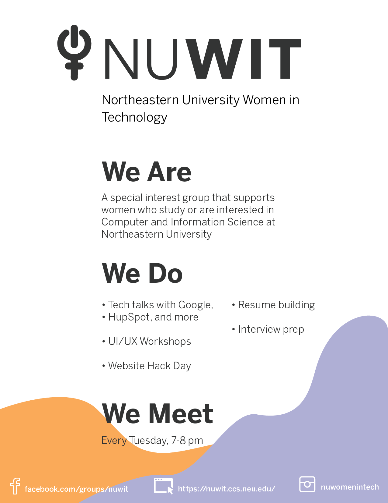
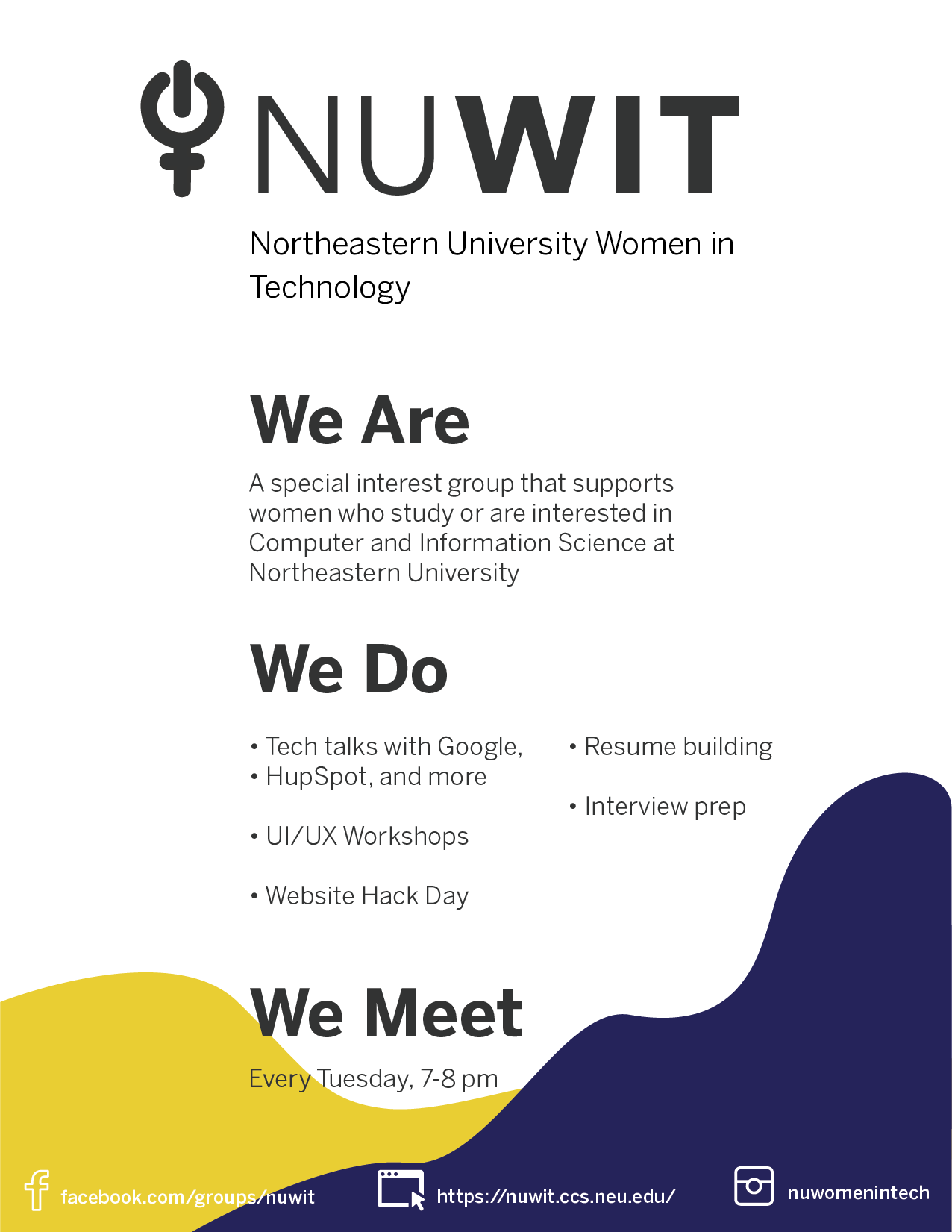
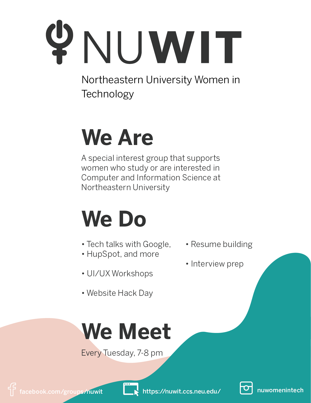
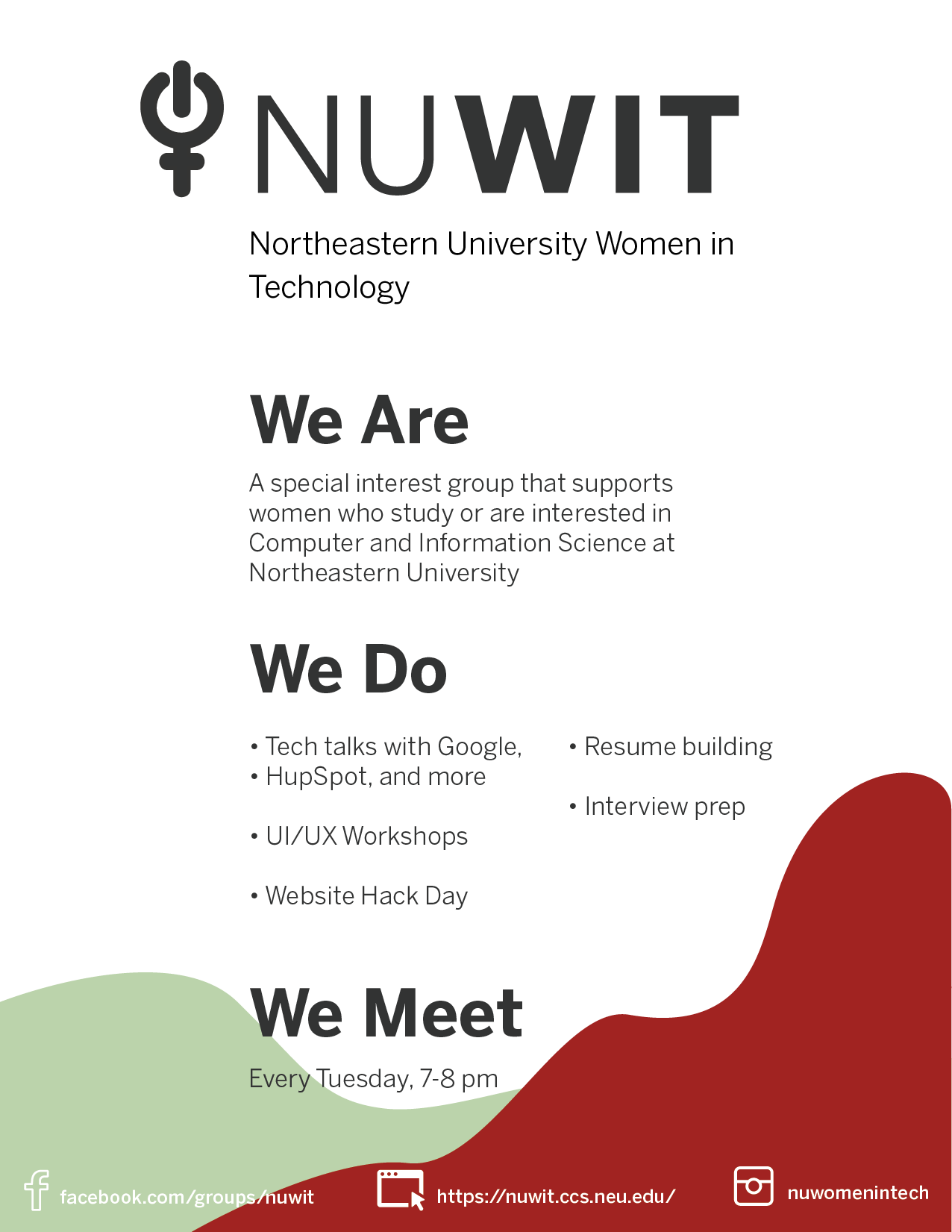
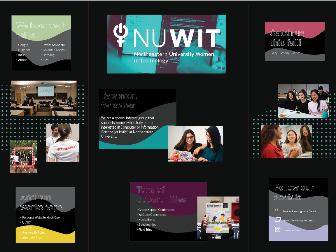
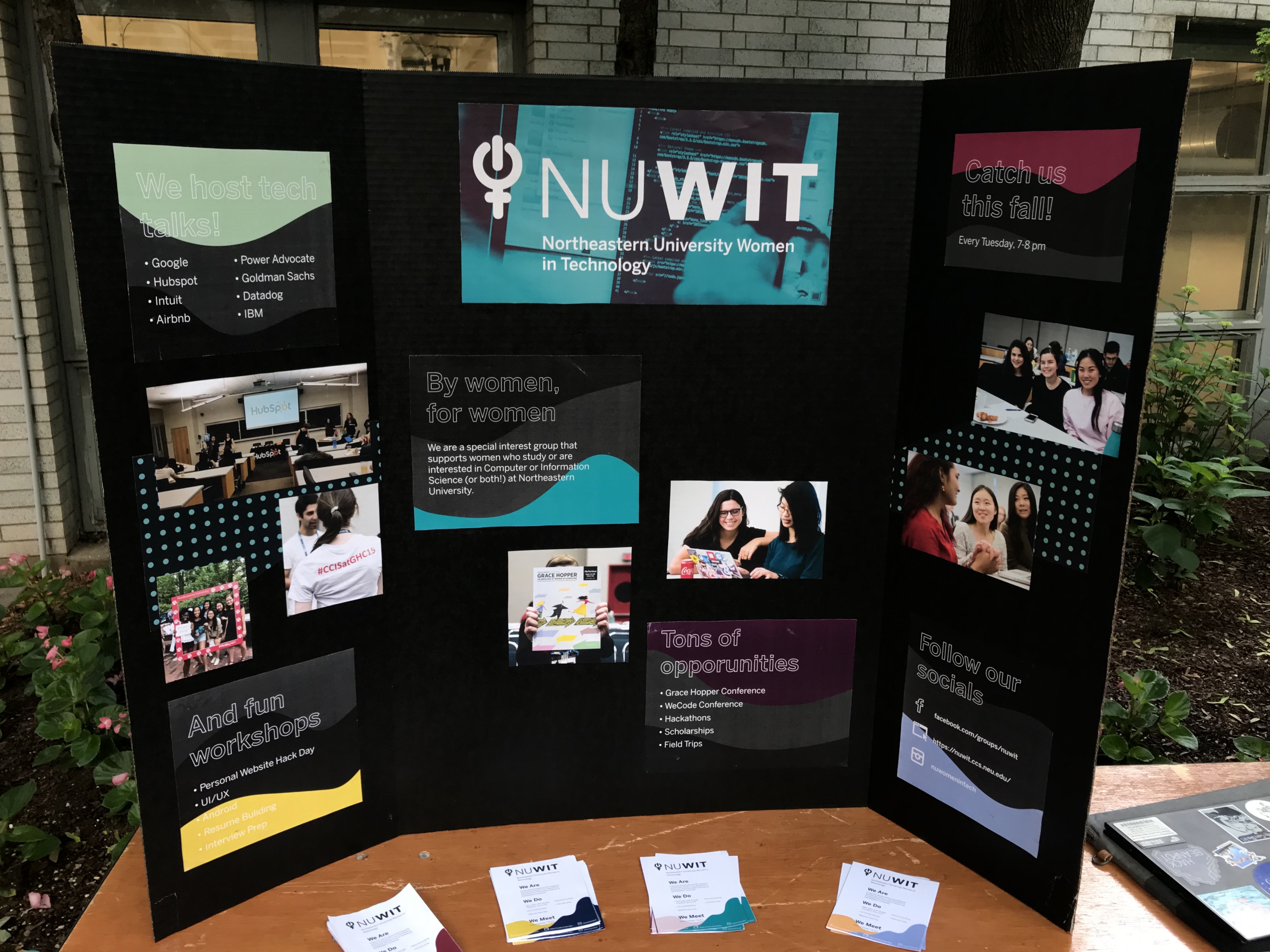
My first assigned task was to create promotional materials for recruitment at freshman orientation and fall fest which included creating a tri-fold “poster” and small flyers to hand out.
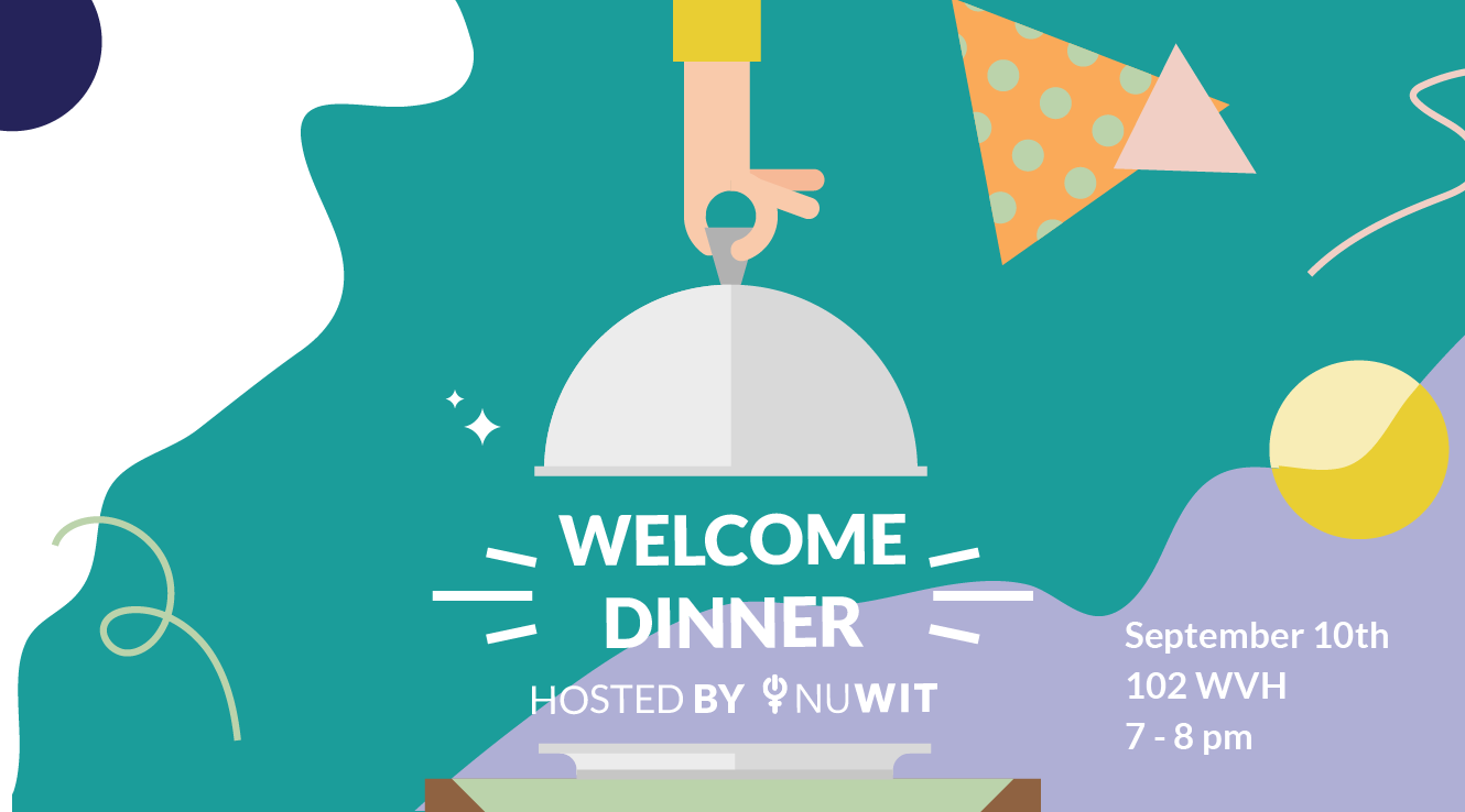
I first started with the flyers. A common mistake I see in a lot of recruitment fliers is information overload. My goal was to make the flyers visually attractive, easy to read, straight to the point. I achieved this by following a “who, what, when, where” structure for the copy and incorporating a fun “wave/hill” pattern. I used various combinations of our primary and secondary brand colors.
For the tri-fold poster I started by creating a mockup in Illustrator. I wanted to continue the “wave” pattern theme I used in the flyers, adding a few different accent colors. I decided on using a black-trifold board to make the overall “poster” look more elegant and so the colors could stand out more. I also experimented with a duo-chrome photo treatment as the background for our logo/header. I made sure to put the most important information in the center, the most interest-peaking information to the left, and connection information to the right (since we read left to right).
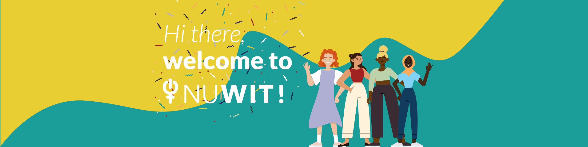
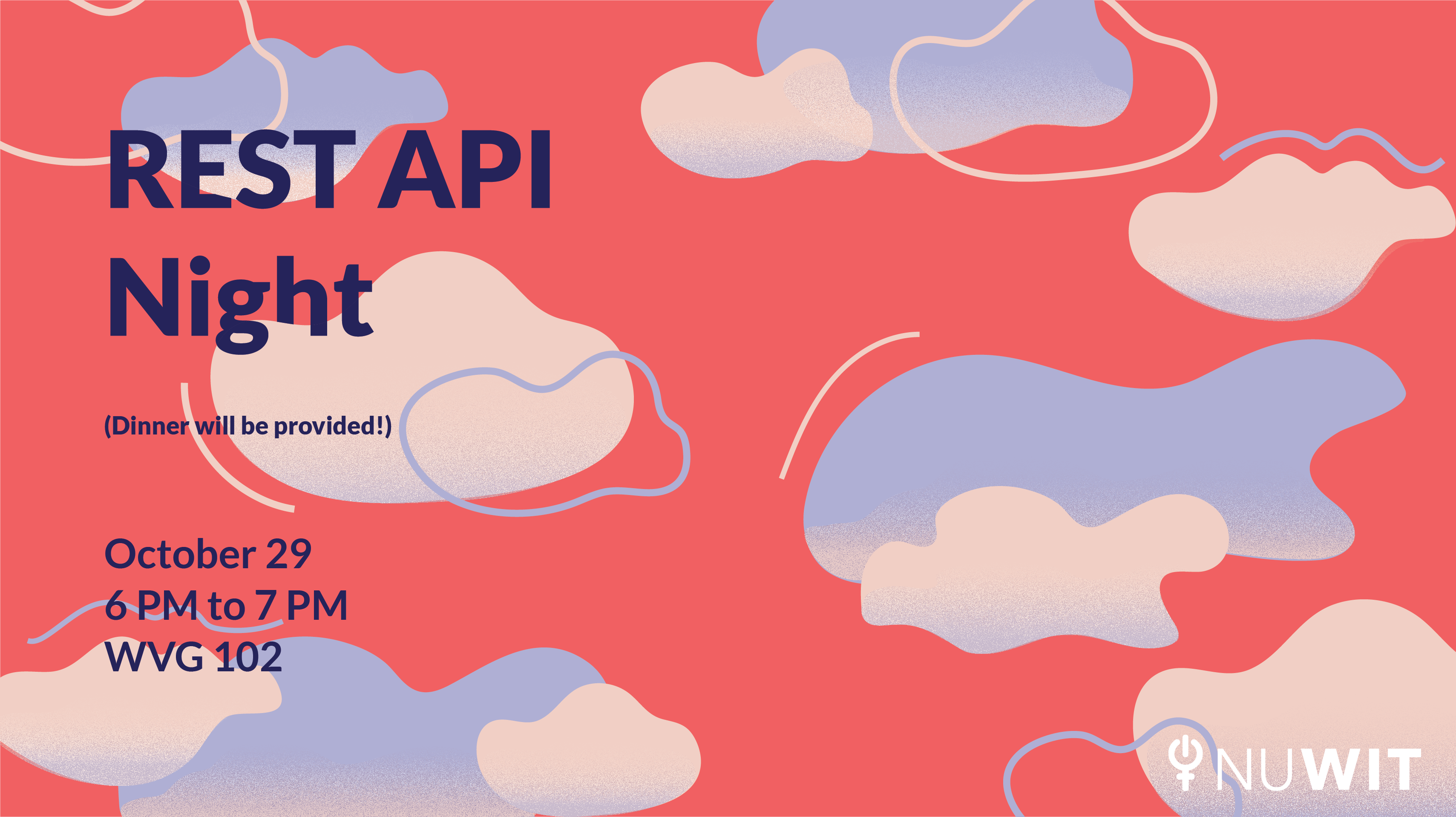
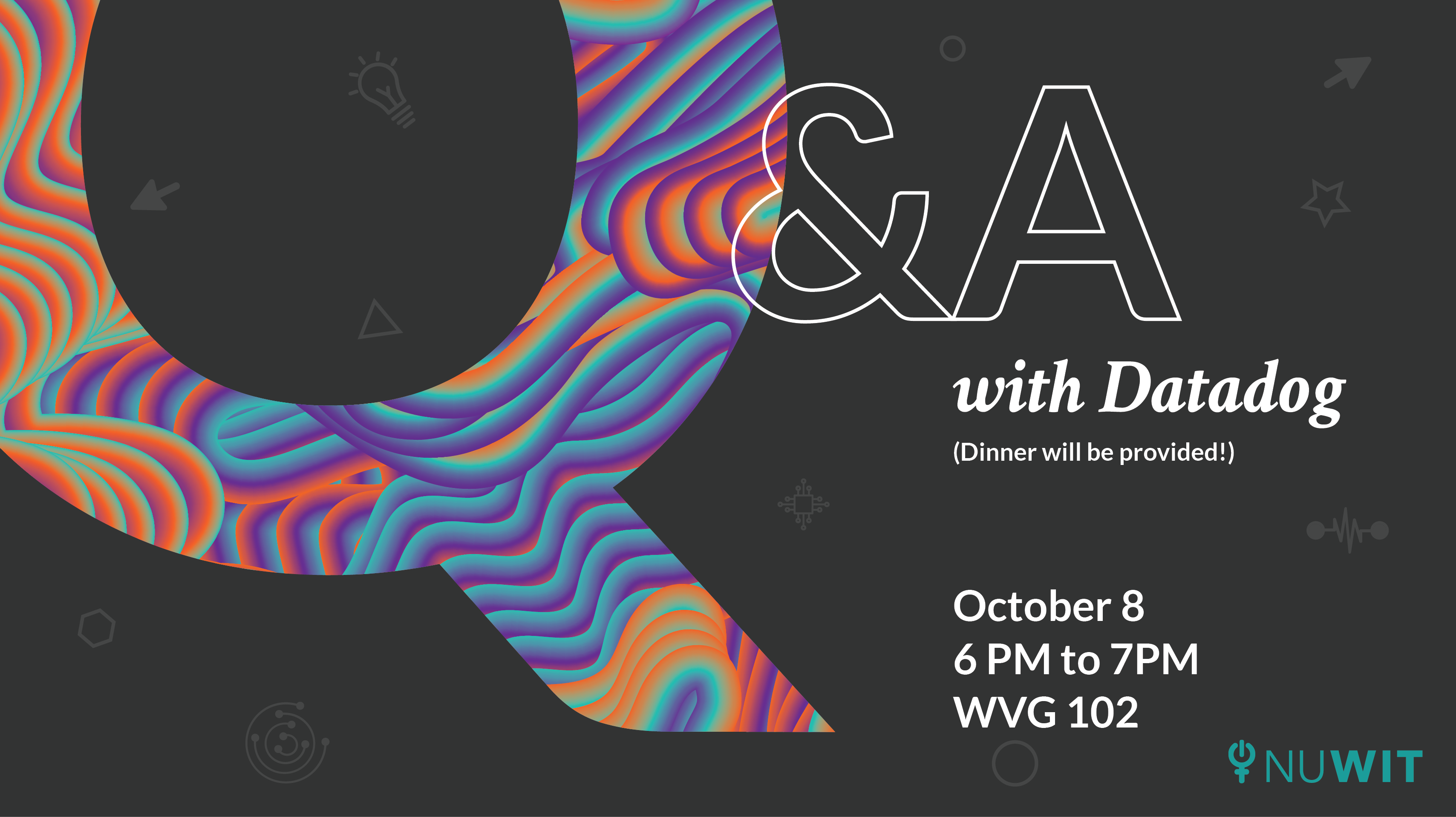
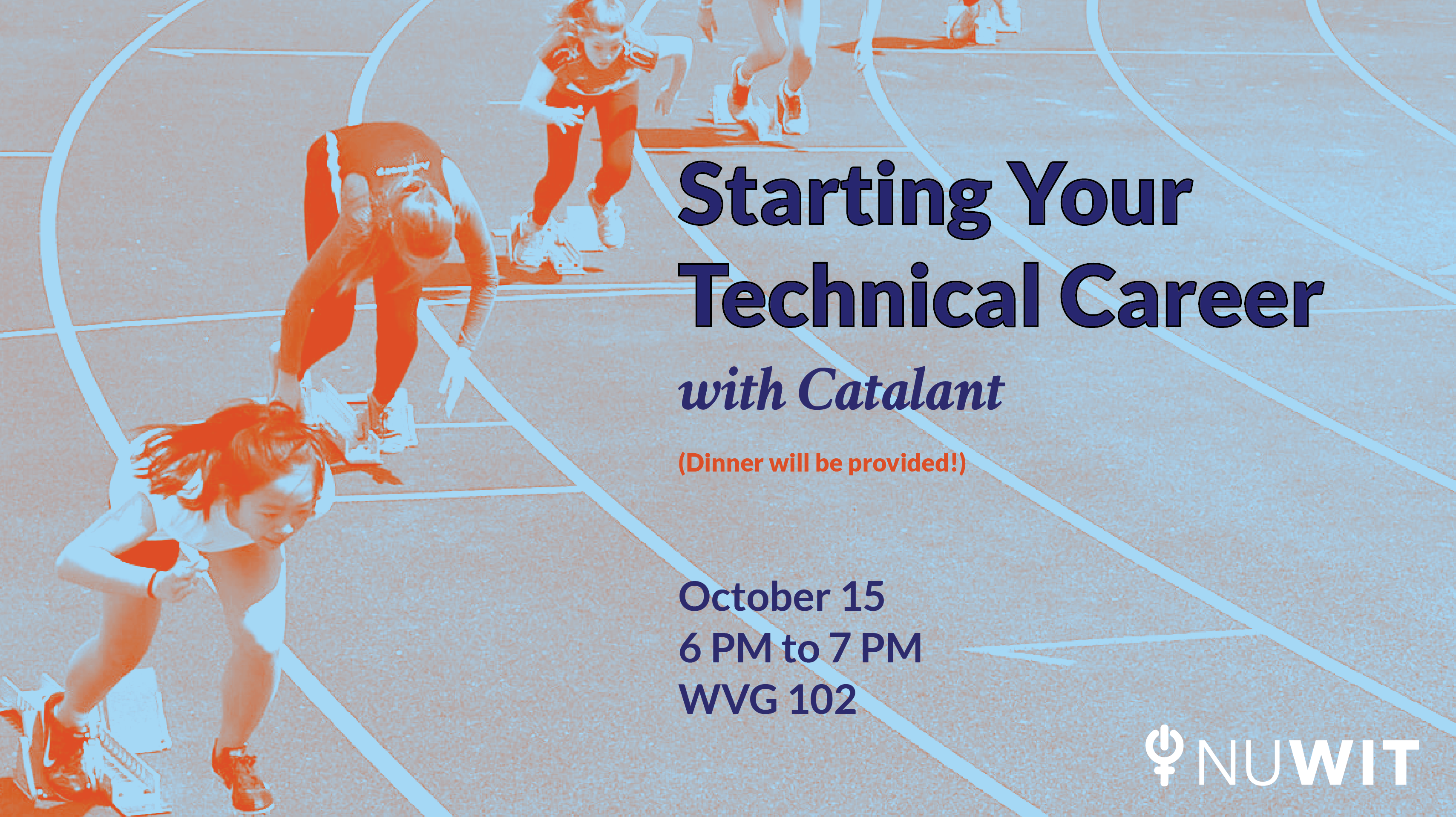
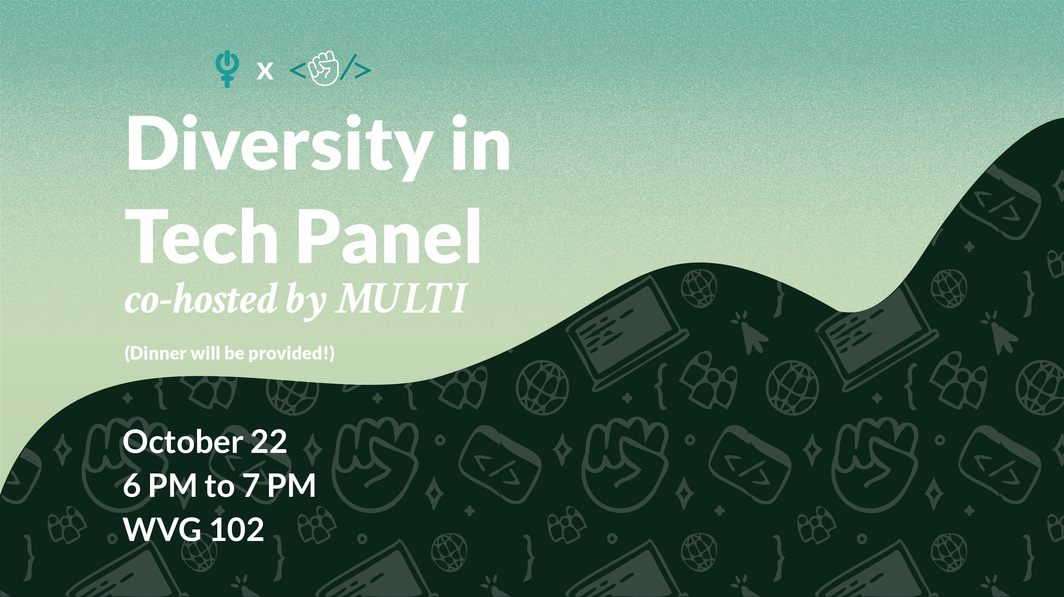
Currently, my main responsibility is creating digital marketing materials for Instagram, Facebook, and MailChimp emails. I work in an iterative process, having a day (or two) dedicated to posting first drafts, receiving feedback, and submitting final designs.
Designs are tailored to the theme or content of the upcoming event. However, each design follows the same format in terms of placement of text, typefaces used, etc. So far I have tried to keep the illustrative style similar from event to event while also pushing the brand exploring different techniques. I have also actively incorporated emerging brand elements into the materials to create the consistent look and feel I’ve been aiming for.
Below are some of my favorite designs I've done so far 😄

By the end of this year I hope to have finalized designs for future NUWIT merchandise. I have many ideas for items like stickers, tee shirts, hats, beanies, etc.
By the end of my term (spring 2020) I hope to have an official brand book/design system for NUWIT. I have already begun this process by internally condusting branding exercises with the e-board, redesigning our logo, defining type, and solidifying primary and secondary brand colors.
Stay Tuned!
