DIS
CO
VER
BUTTER
Web Design
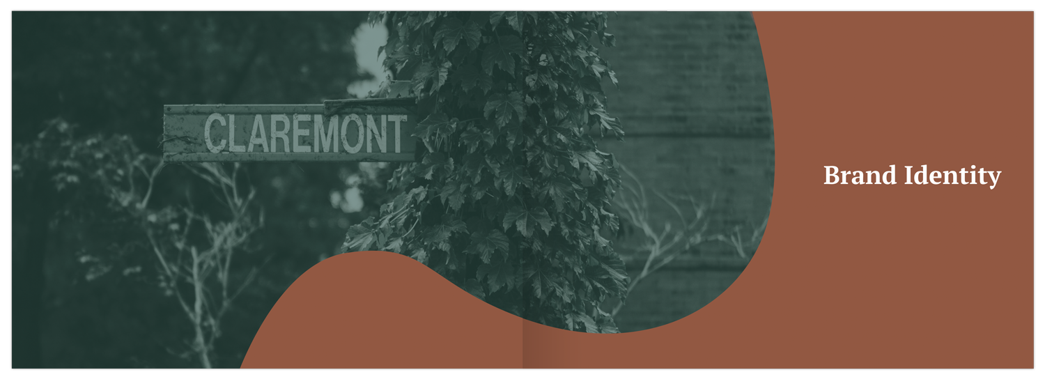
Brand Identity
Interaction Design
UI Design
Developer
January 2019 – April 2019
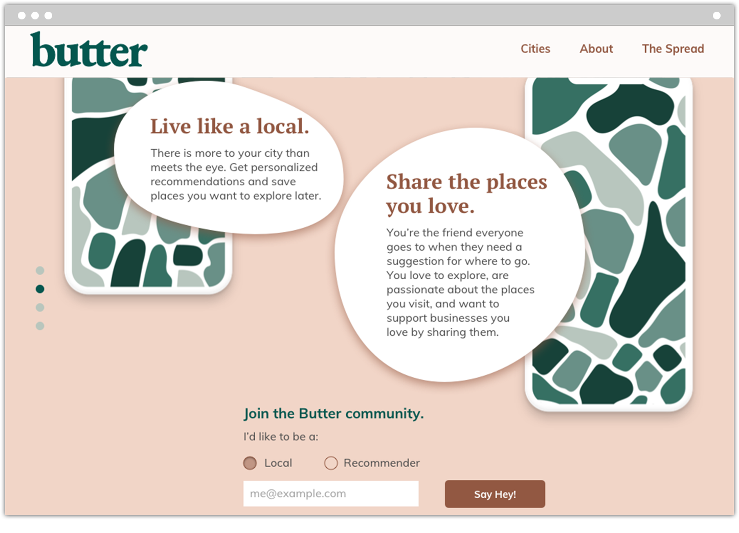
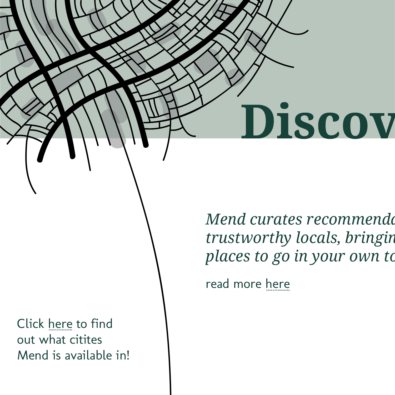
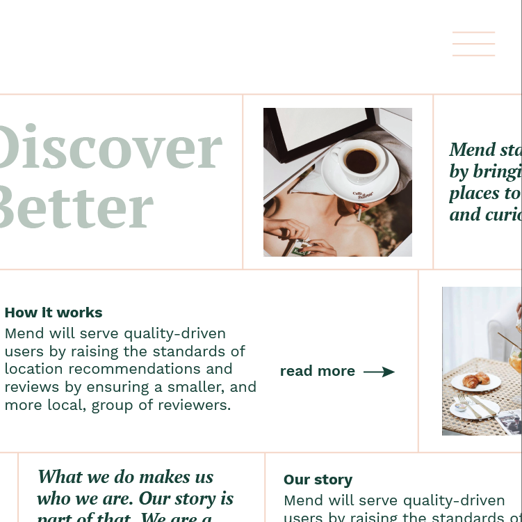
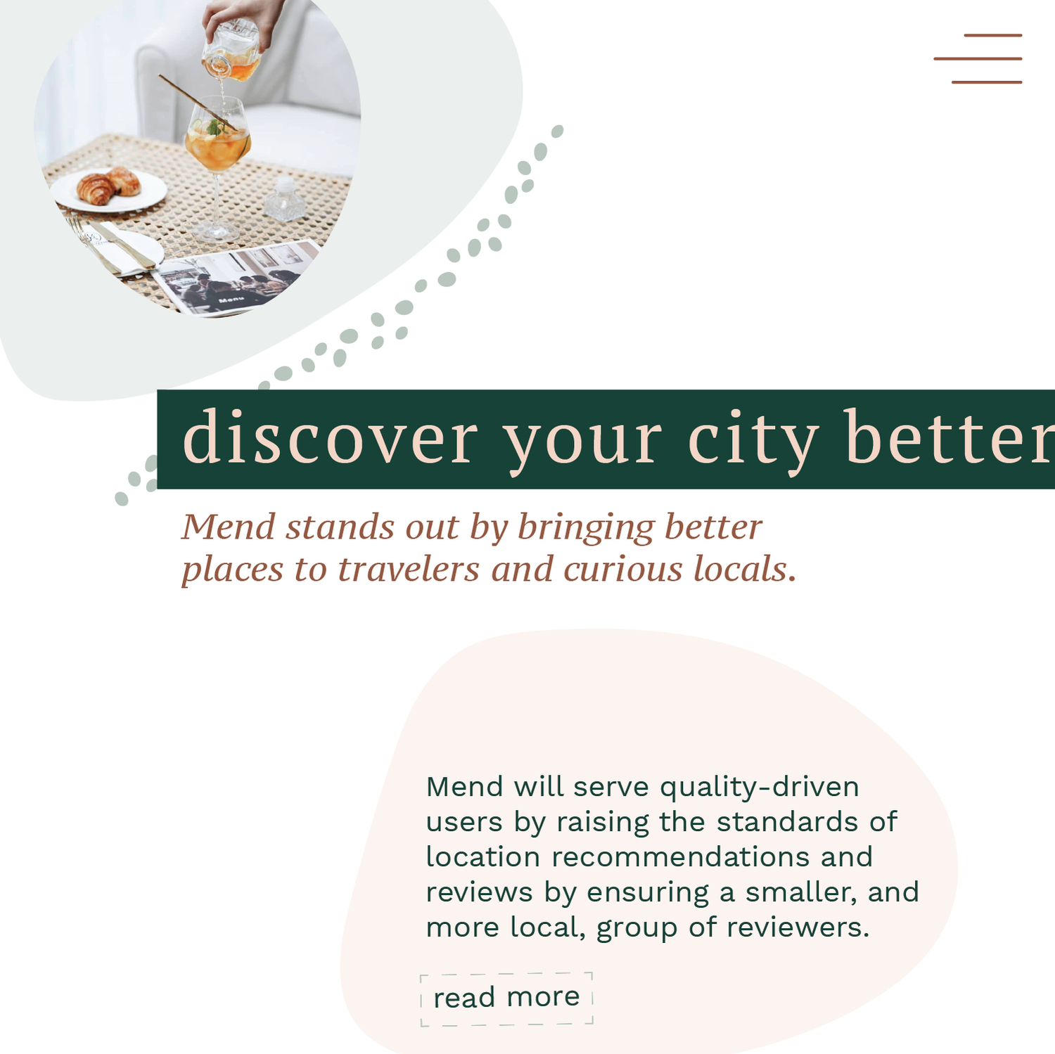
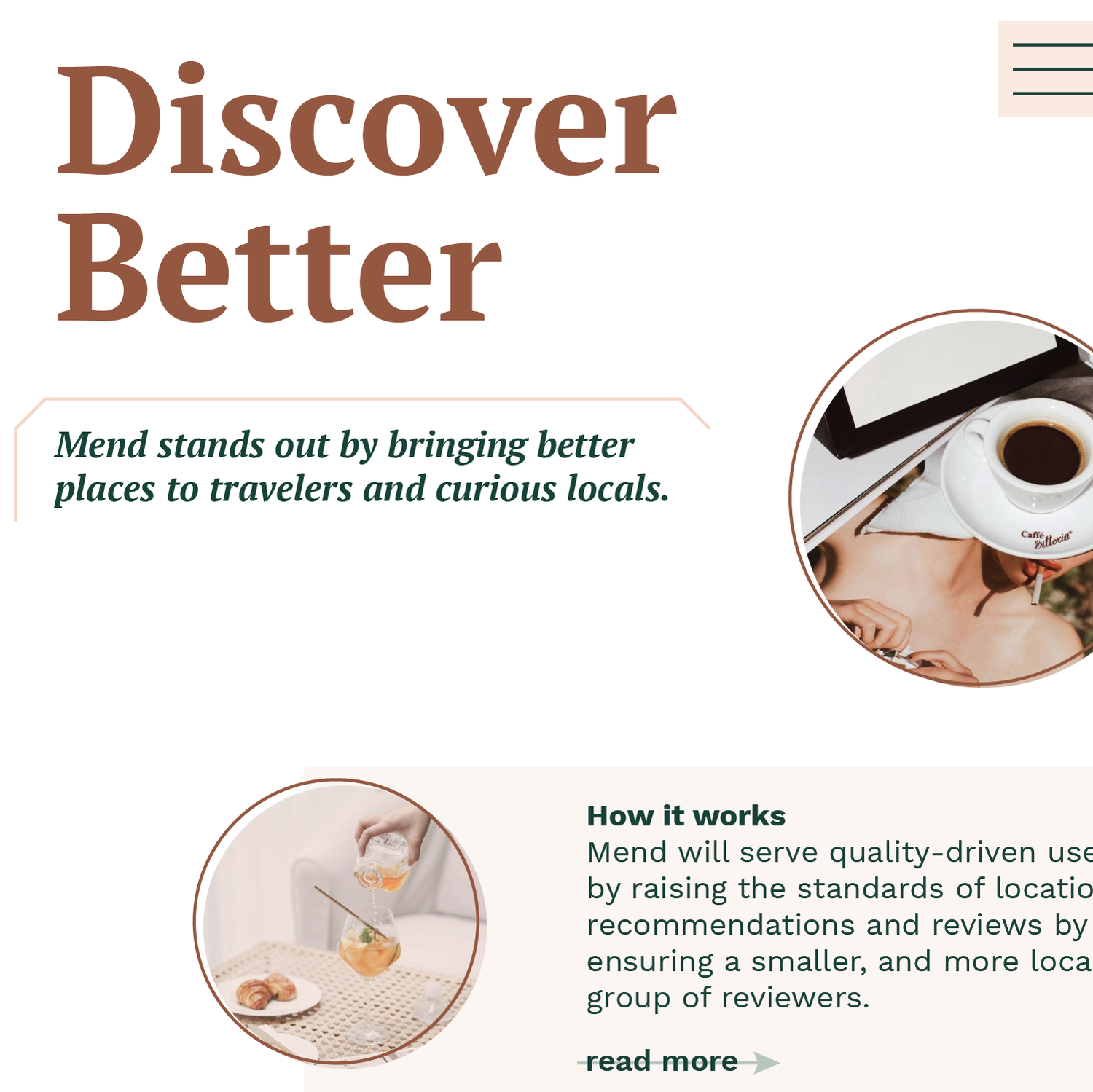
A platform that curates thoughtful recommendations for locals and quality-oriented travelers who want to discover better places in an era of information overload.
During the spring semester of 2019 I worked as a developer for Scout, Northeastern’s student-led design studio. Scout was engaged in the earliest stages of the project; our objective was to create a brand identity and responsive marketing site. The team helped our client build Butter (formerly Mend) from the bottom-up, defining target audience types, researching brand competitors, and developing the brand's personality. Butter served as my first-ever client project.
Our team consisted of five members: one project lead, two designers, and two developers (including myself). For the first few weeks we spent time translating our client’s vision through a series of brainstorming exercises such as brand stars, personality levers, mood boards, the elevator pitch and more. Additionally, we also performed research into our client’s competitors and companies our client considered “brand adjacent,” like Airbnb and Away.
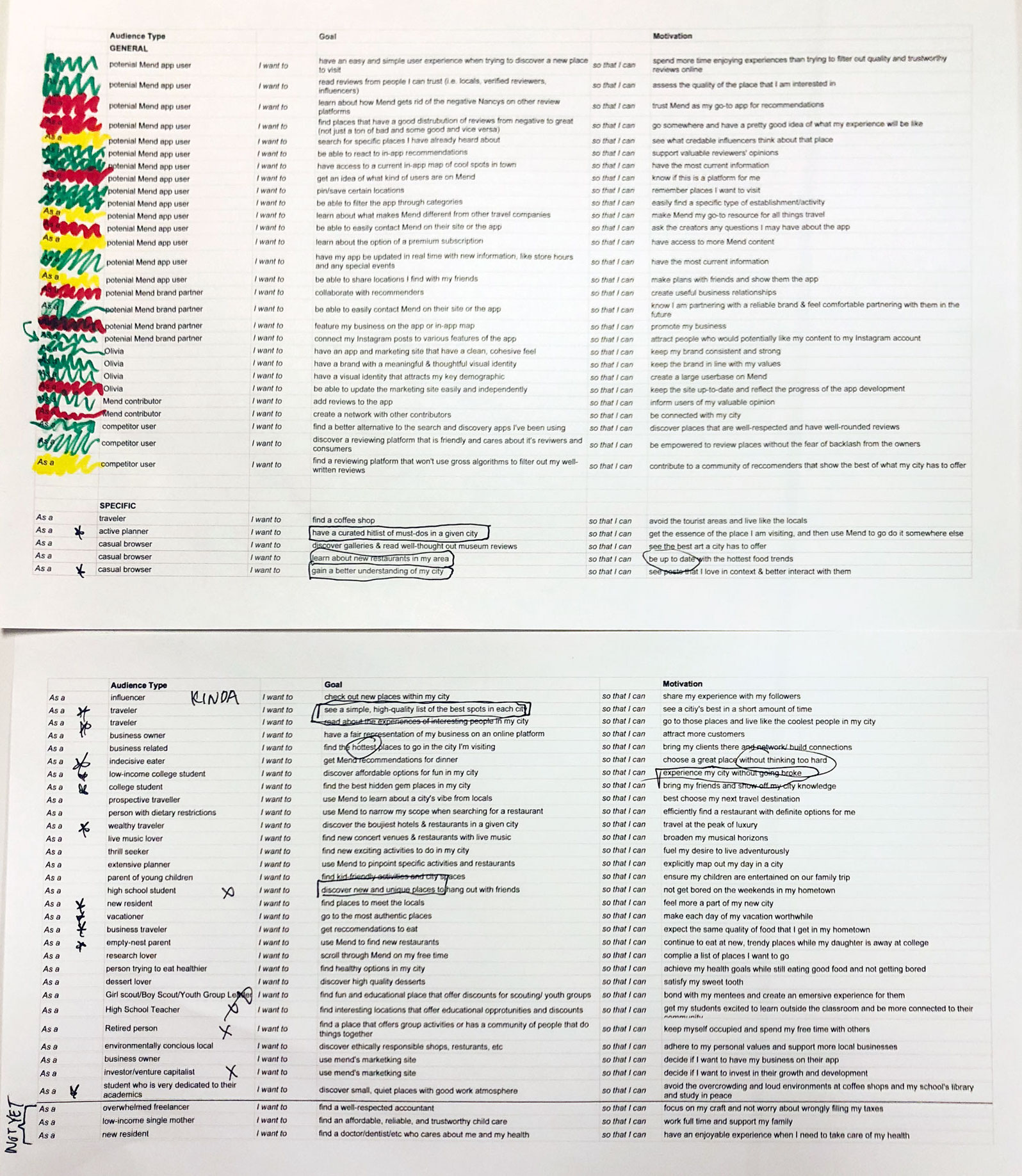
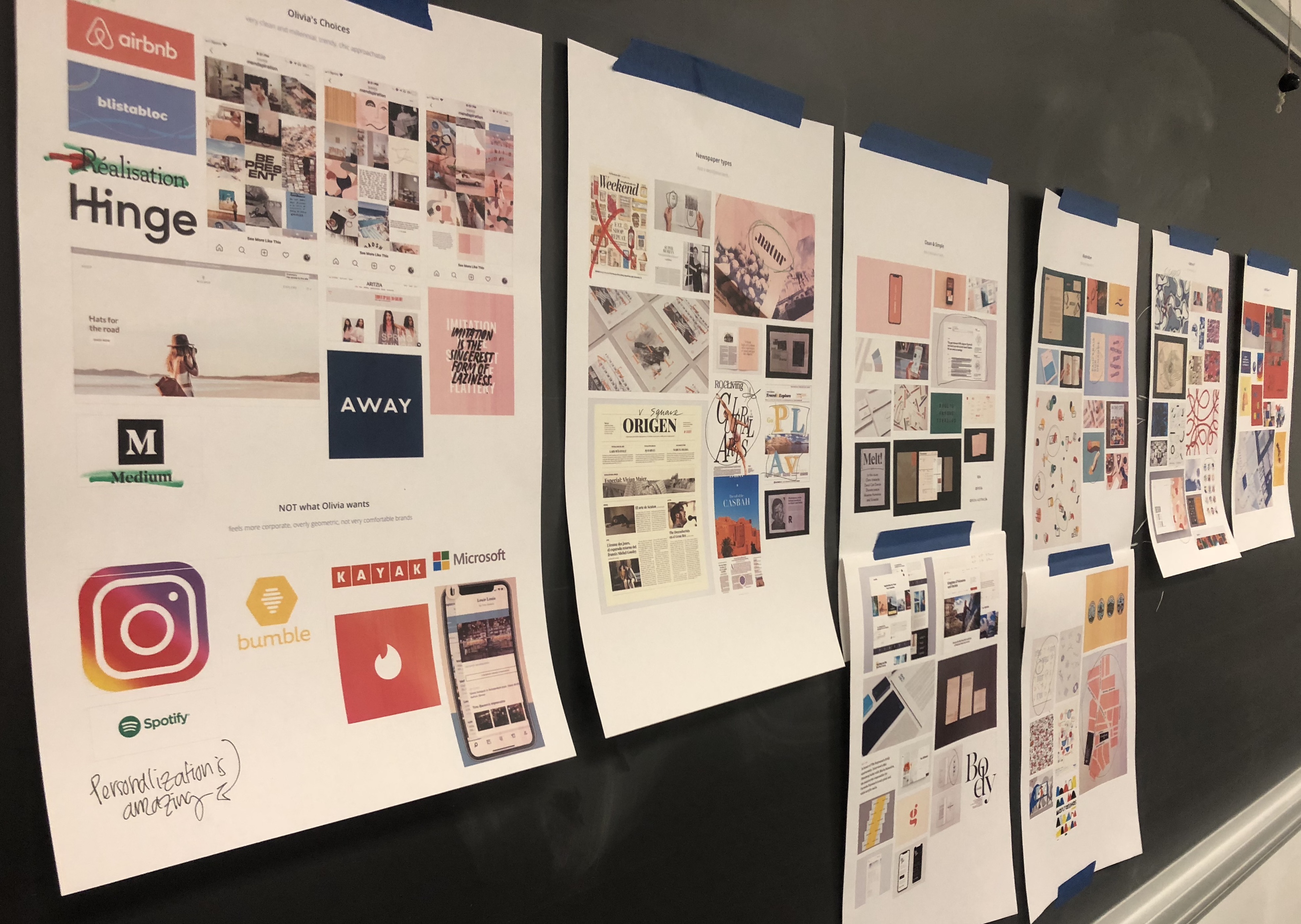
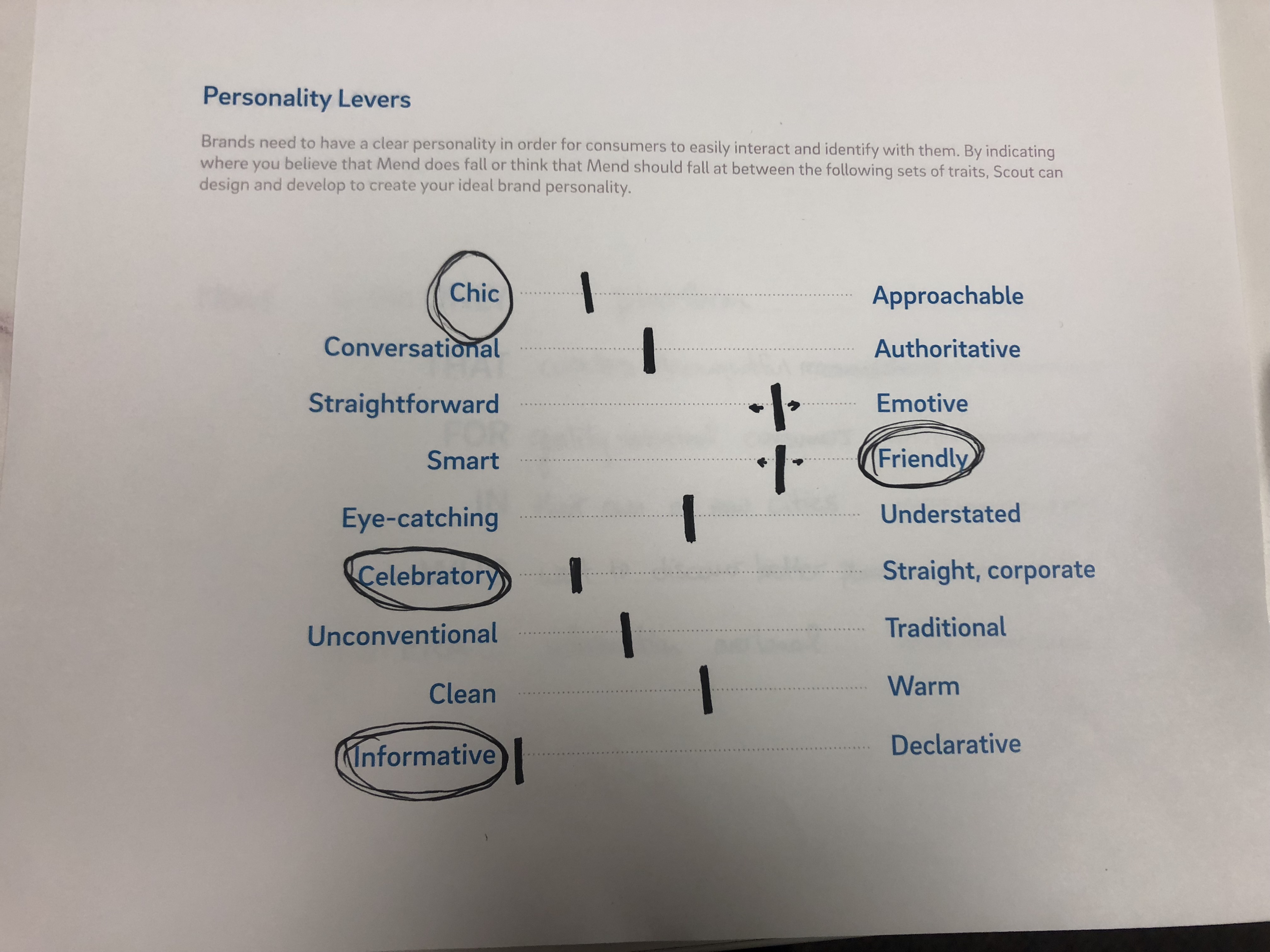
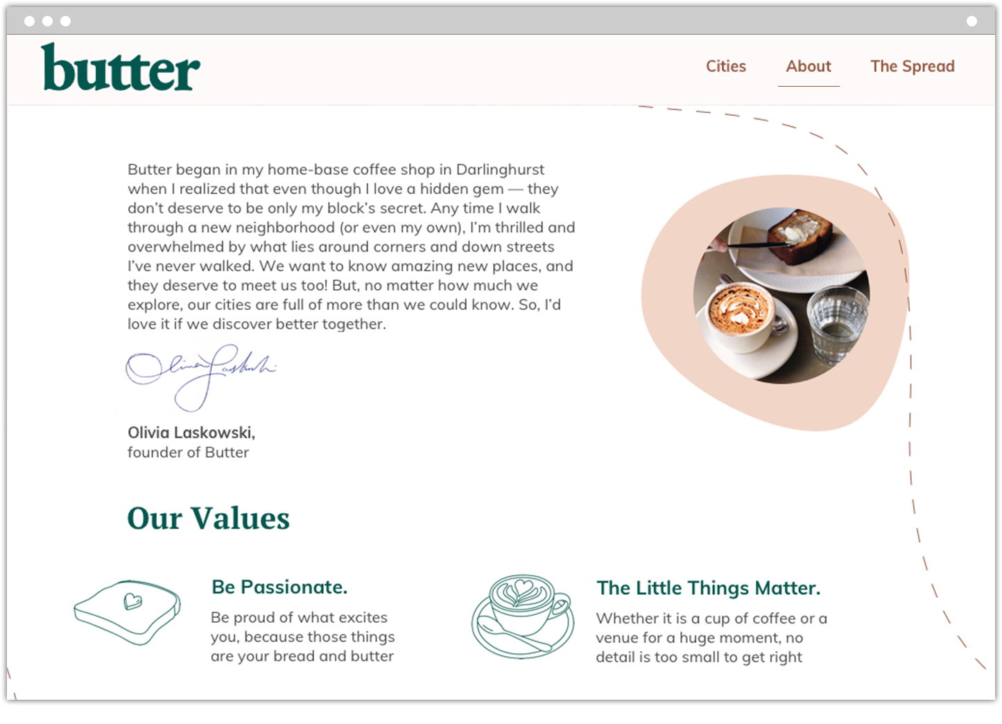
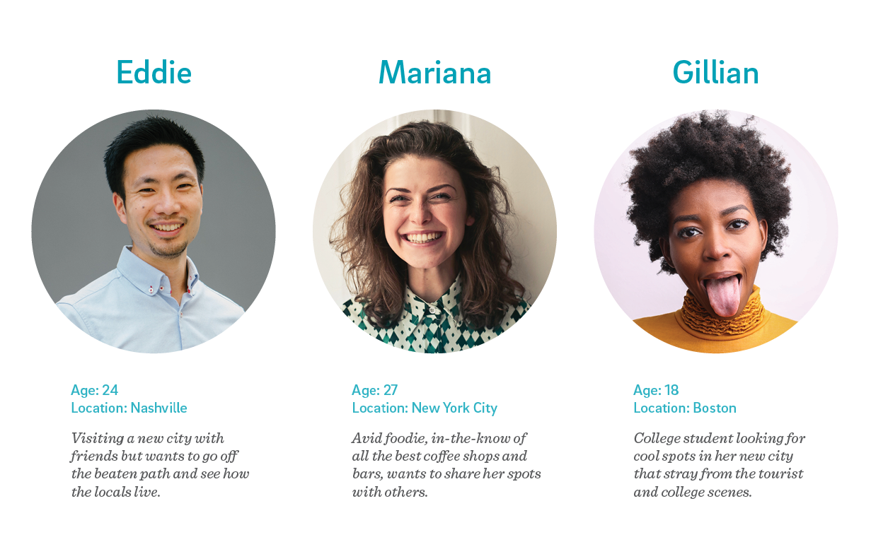
In the early stages of brand development, the team created personas which allowed us to intentionally direct our work, develop empathy throughout our interface, and stay on track with intended users. This exercise gave both the team and our client a clear picture of the target user. Once we developed a more concrete understanding of Butter’s brand voice and target audience, the next step was to dive into color, type, and logo explorations.
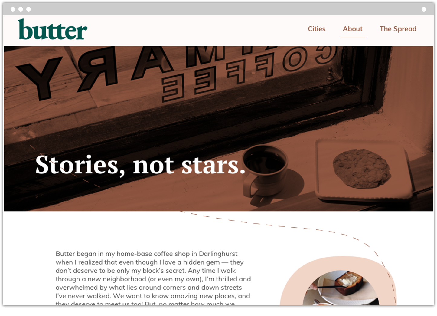
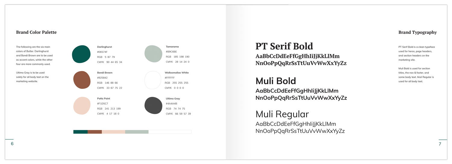
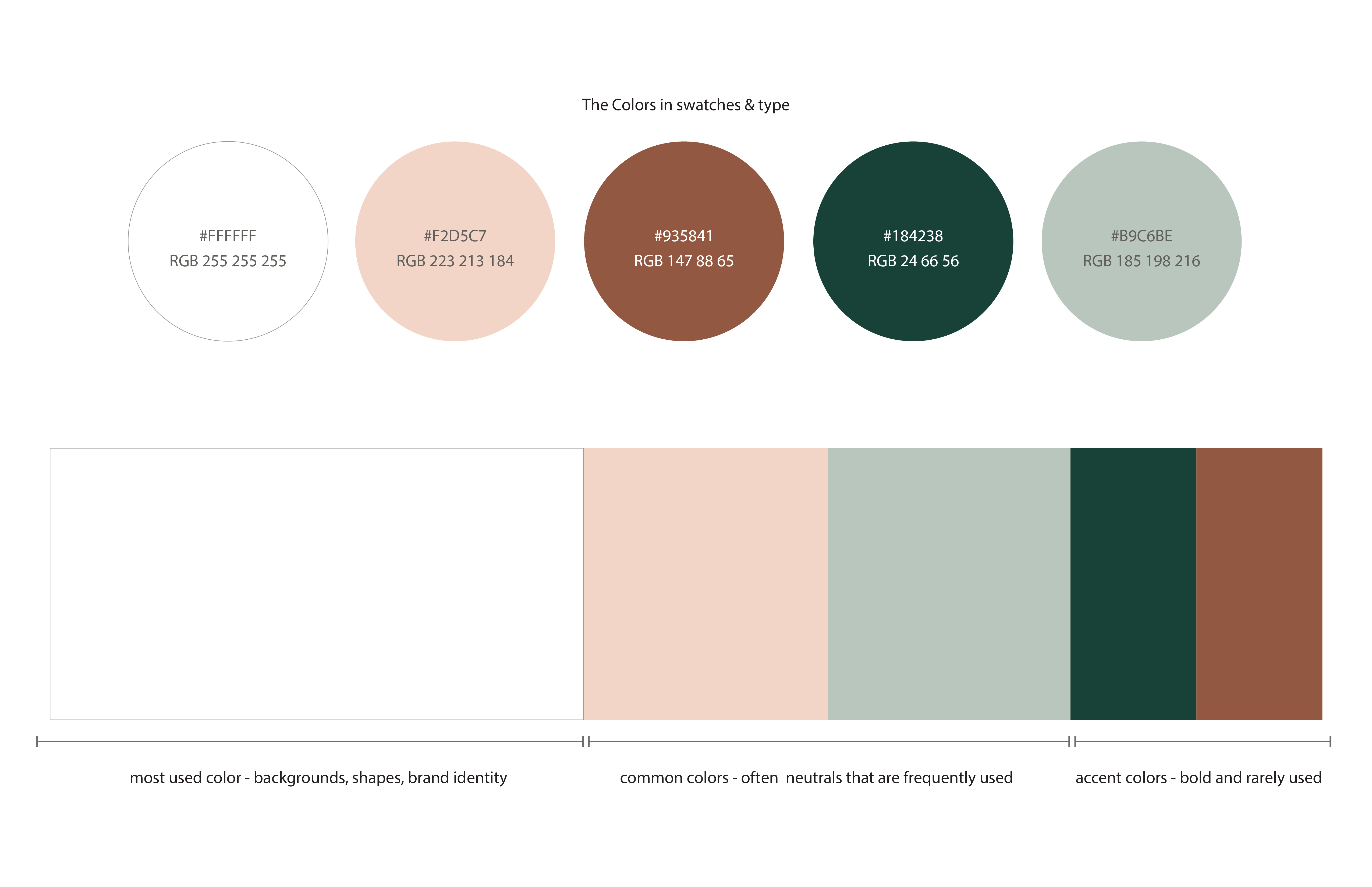
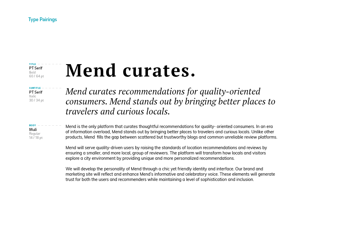
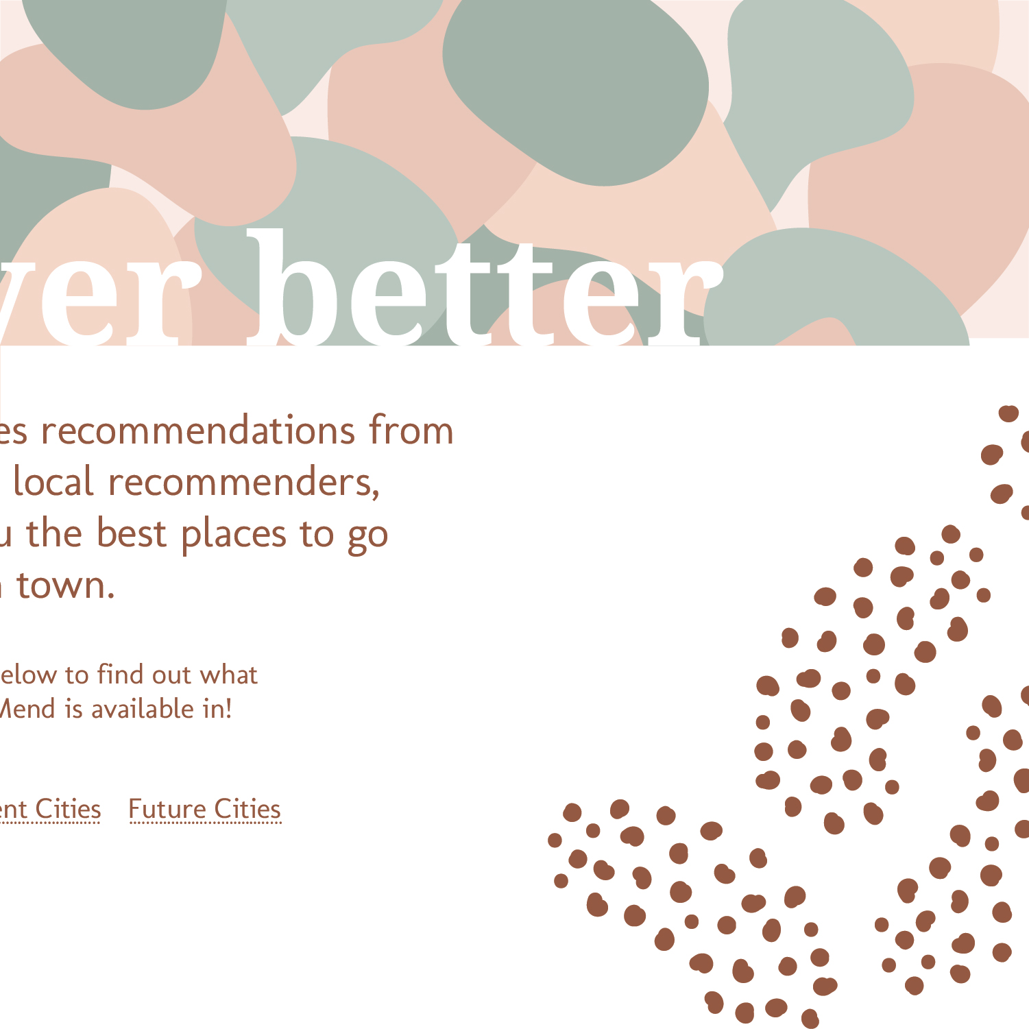
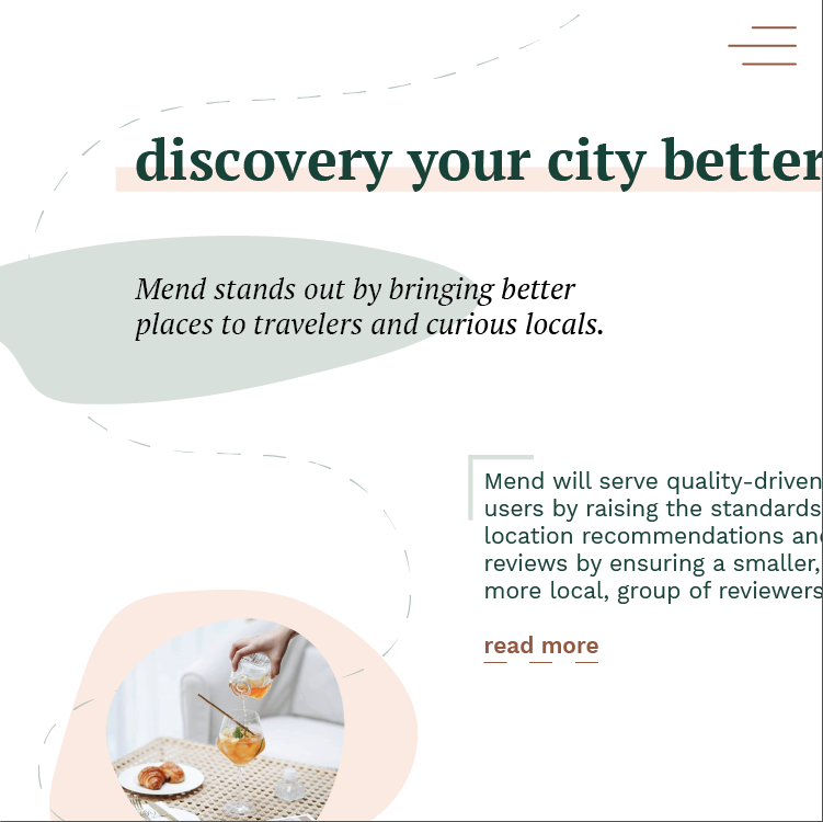
For colors, we chose a mix of warm and cool earth-toned neutrals to help convey Butter’s friendly and chic personality. We chose PT Serif as our header font for bold, clean look and humanistic terminals which give a sophisticated and playful feel. To convey Butter’s more functional and informative size we chose Muli, a minimalistic sans serif.
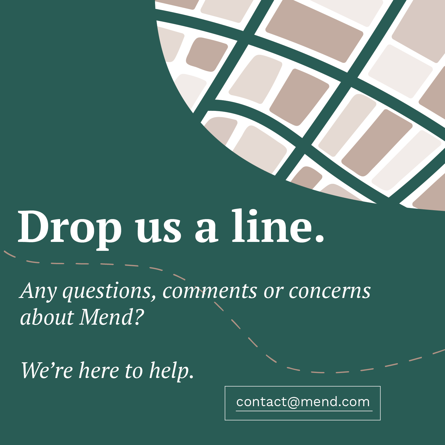
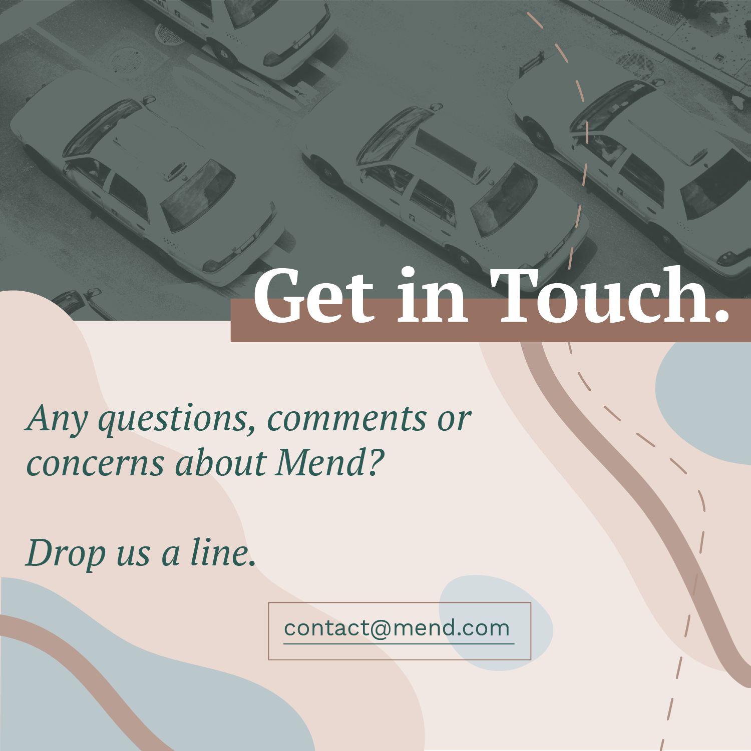
Originally, the title of our client’s concept was Mend (short for recommend). In our initial logo sketches, we explored the ideas relating to travel, mark-making, and quotes. However, one month into the project, our client announced the need for a product name change
Working closely with our client, we explored new names for the company, product, and blog. Eventually, the client chose to continue the branding and product work with the name Butter (a catchy and obscure reference to a fictional elite restaurant). The final logo design combines our client’s desire for the use of organic shapes with a literal interpretation of butter.
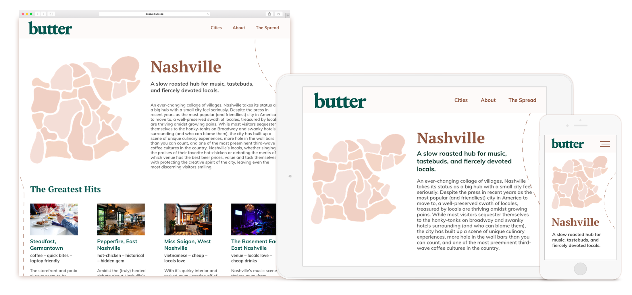
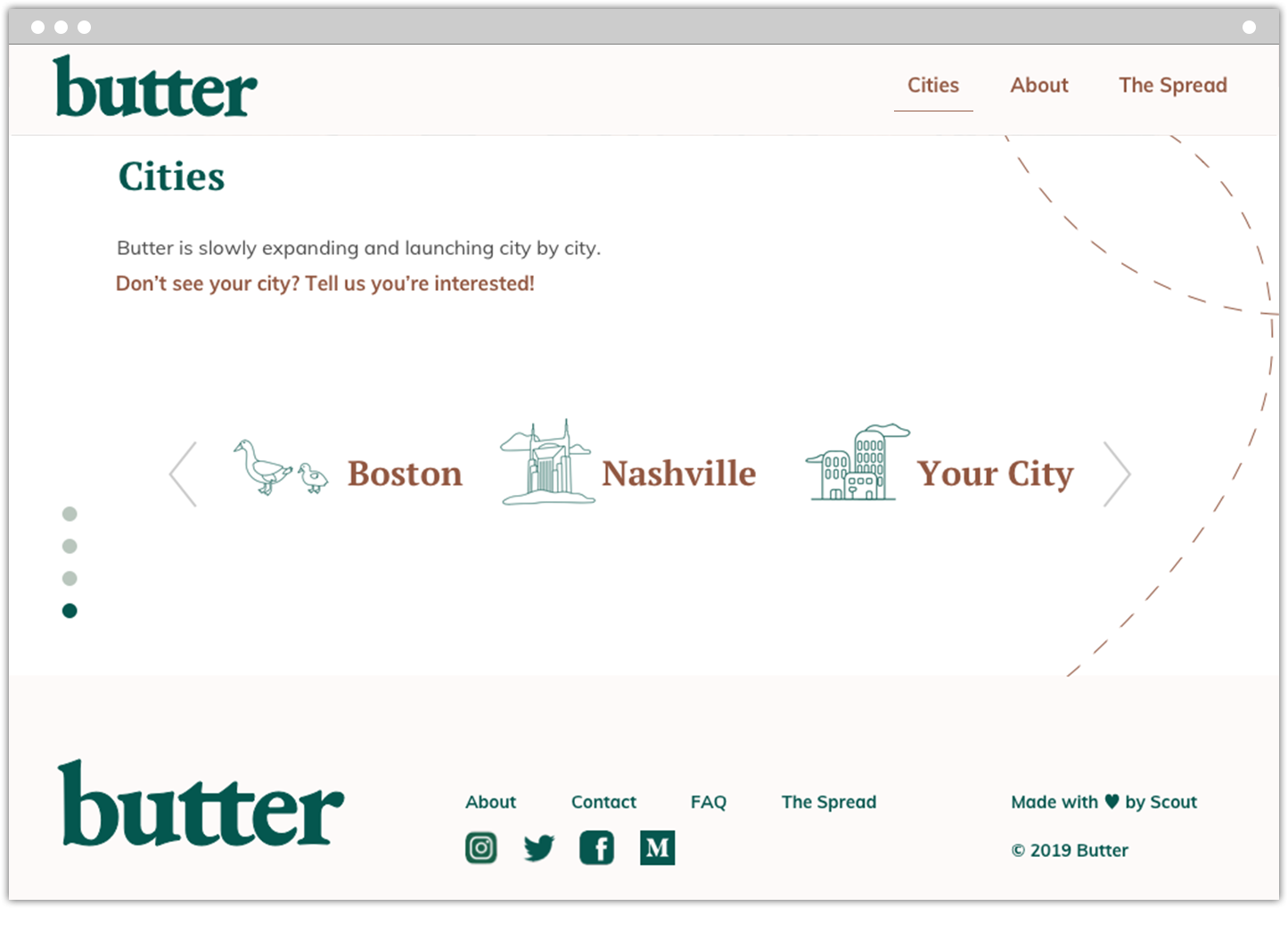
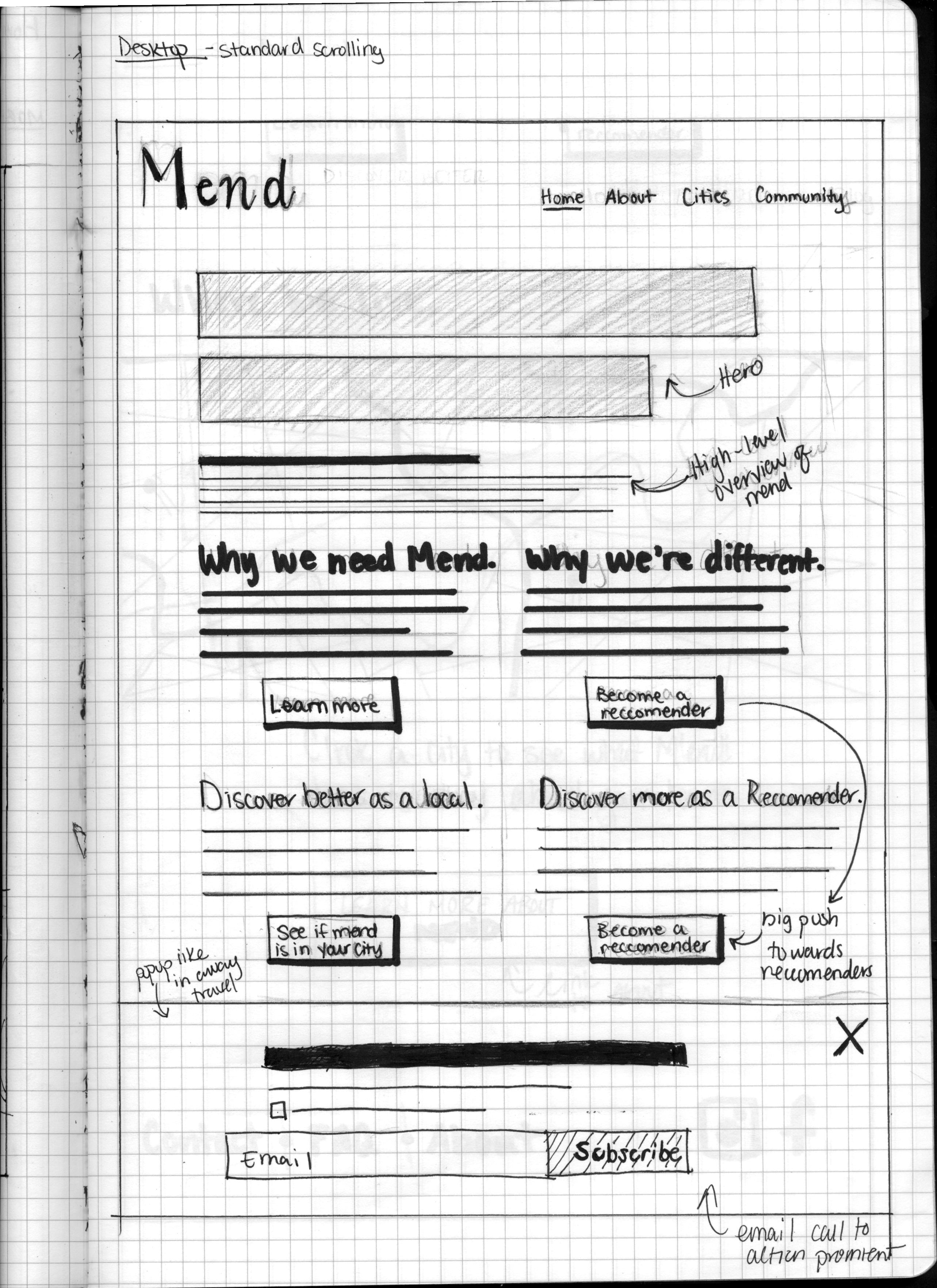
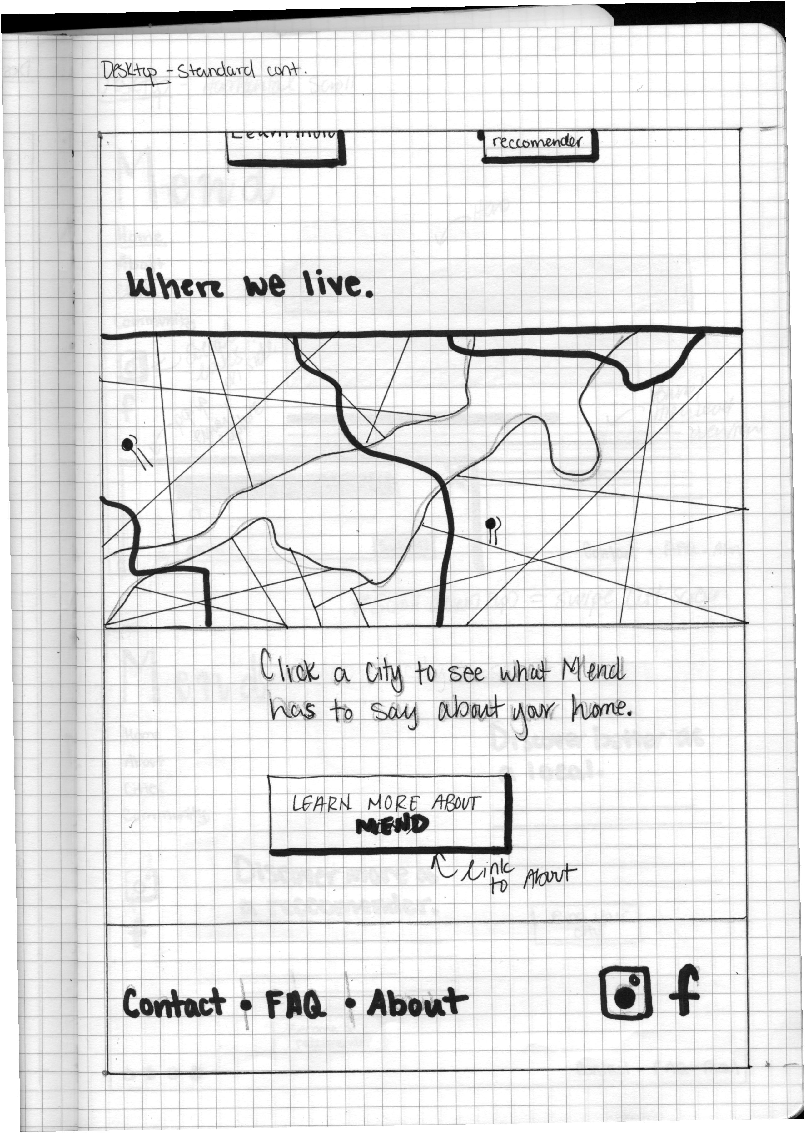
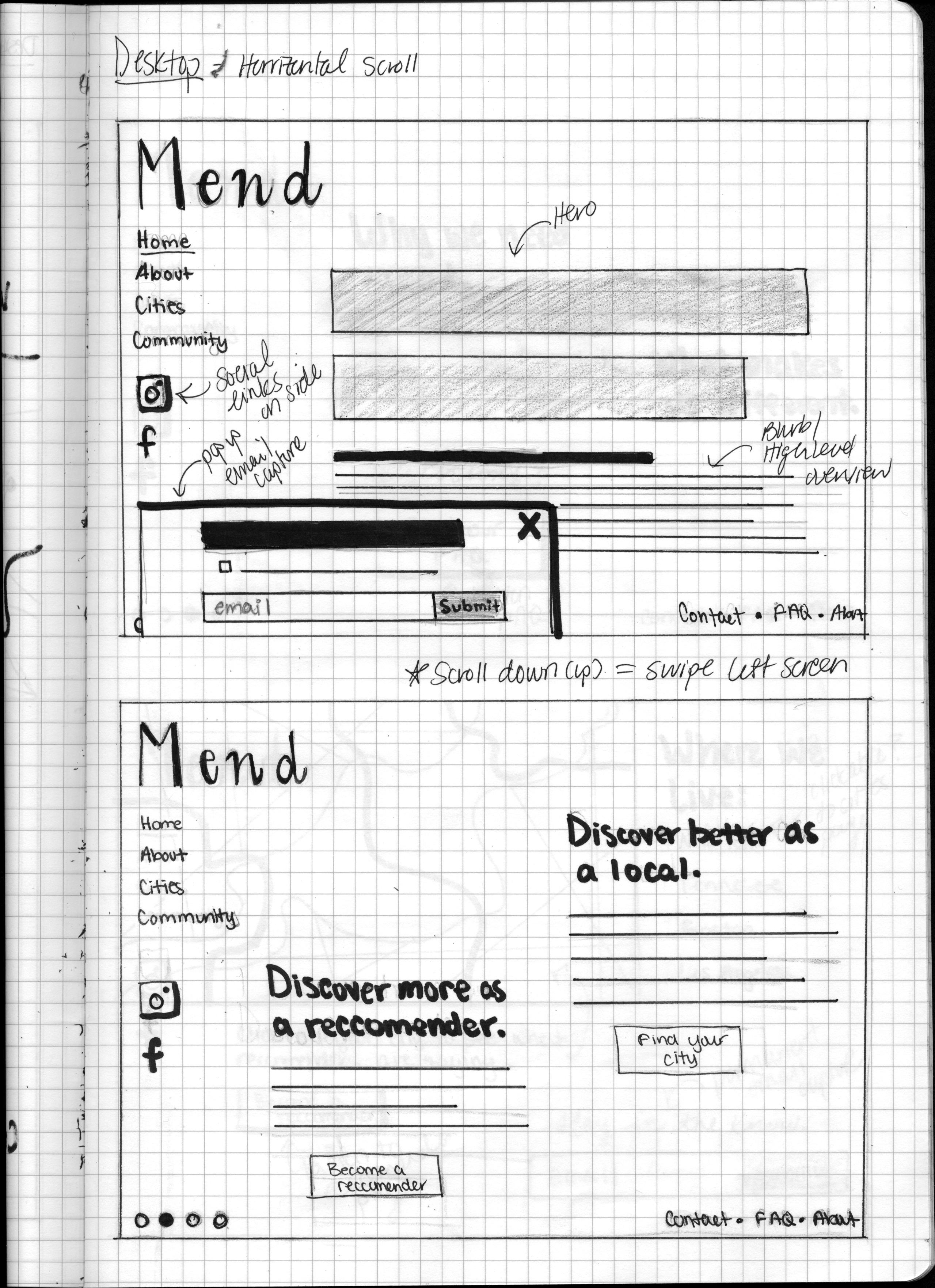
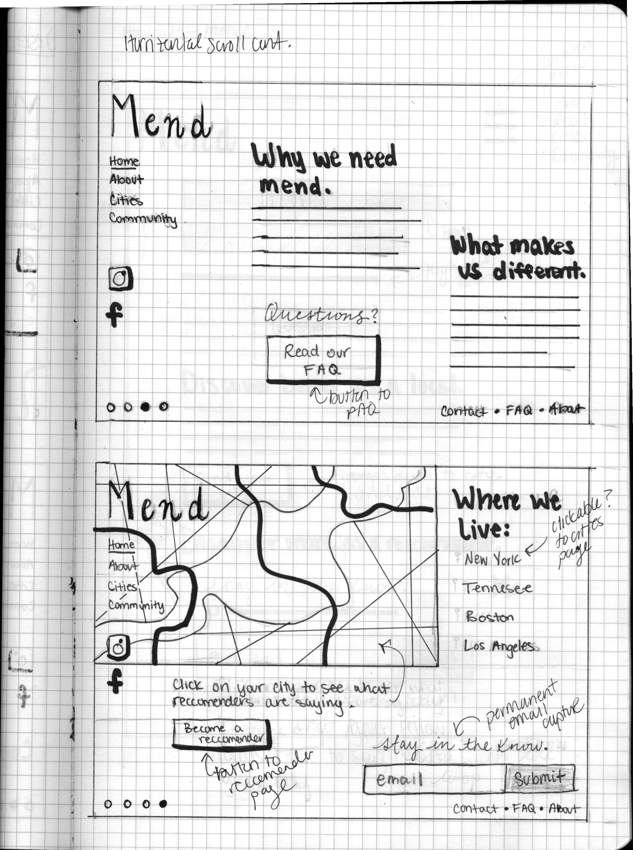
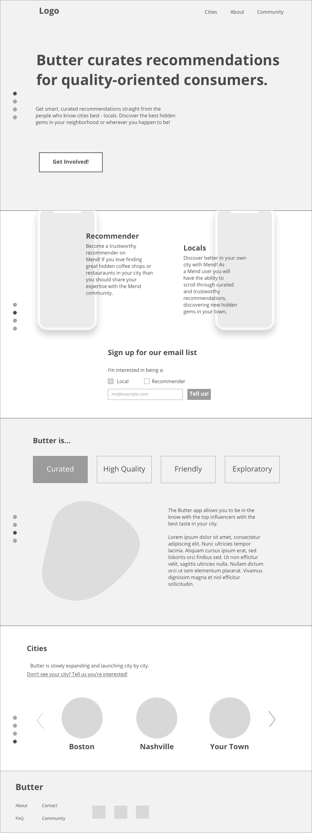
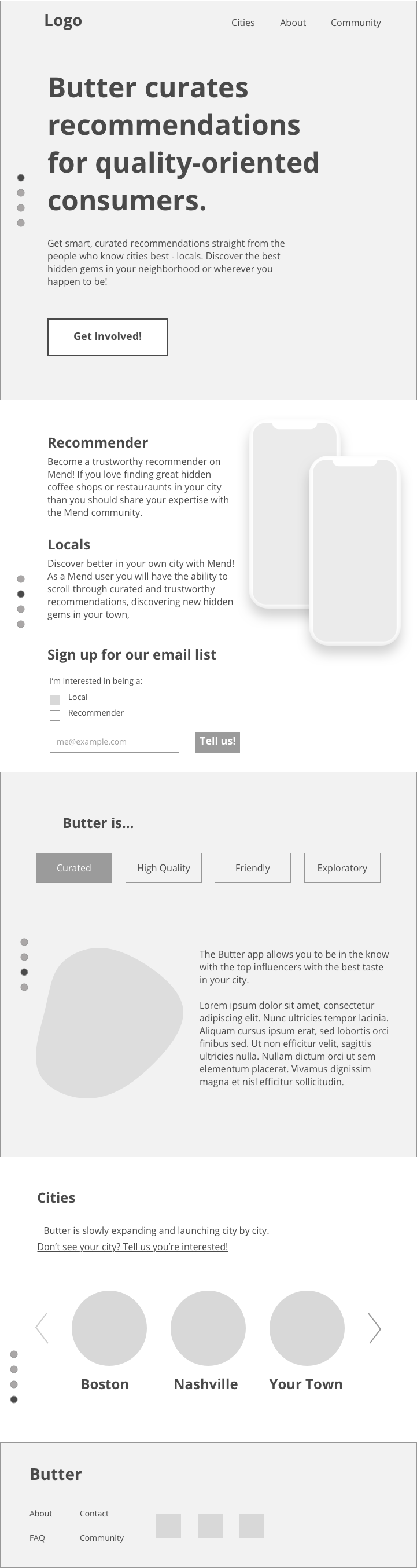
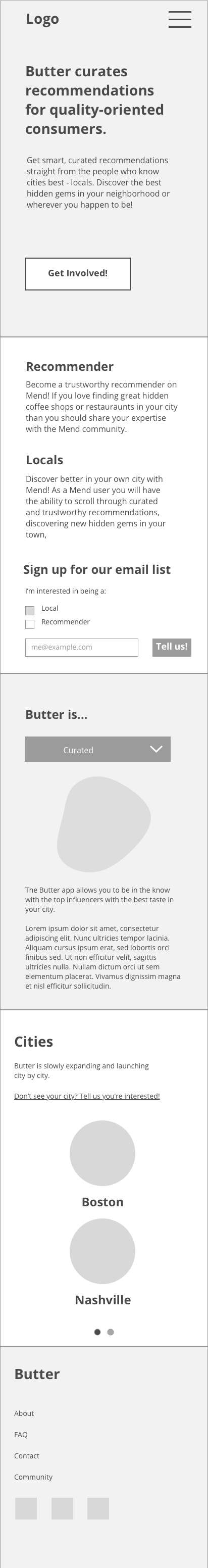
Design and development of the marketing site materialized concurrently; with design informing development. It was important to our client that the website be homepage-focused, so visitors could receive all the information they needed about the product without having to navigate to a different page. Another key aspect of the website was the ability to scale - our client wanted to be able to easily edit and add content to the site without having to rely on a developer.
Keeping this in mind, the dev team opted to use TakeShape, a headless CMS. Originally we planned to use JAM stack to create the static marketing site using the recommended stack - Takeshape with GraphQL and React.js front-end, hosted via Nelify. However, after speaking with Scout’s Technology Director and TakeShape’s CEO and CTO about the needs our project, we decided to use HTML, SCCS, and Javascript(E6) for our front-end stack in order to simplify our process.
We created a few various paper wire-frame sketches that each highlighted different information. In the end, we chose to go with had a robust homepage with strong brand introduction and multiple call to actions.

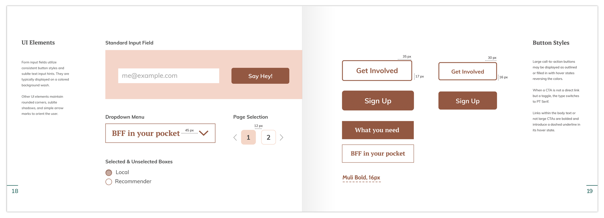
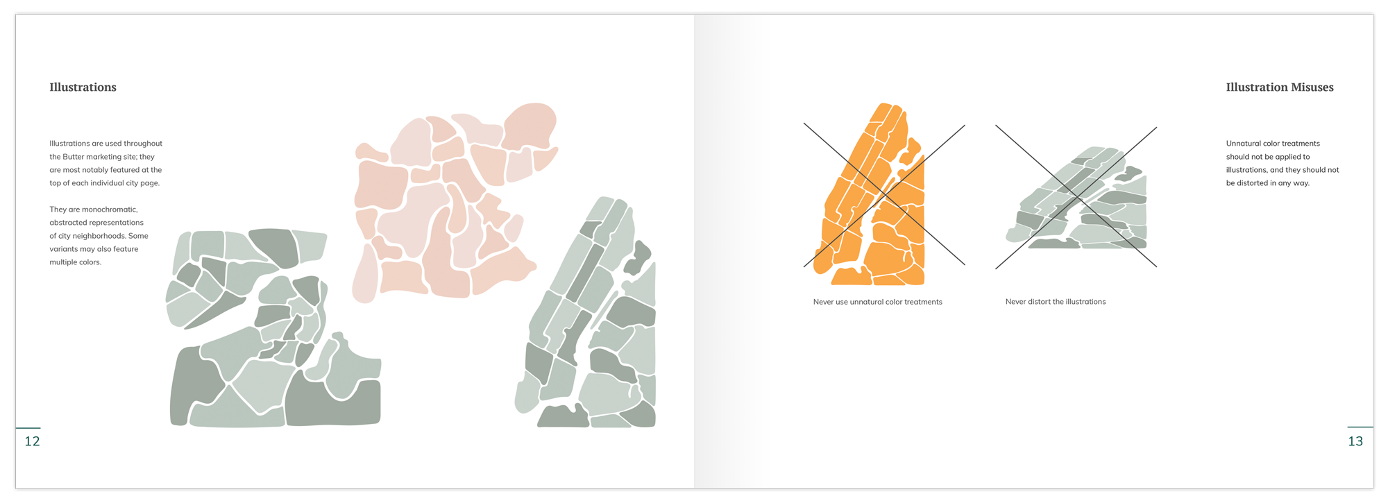
Design deliverables consisting of fonts, colors and interface elements that communicate the essence of the visual brand.
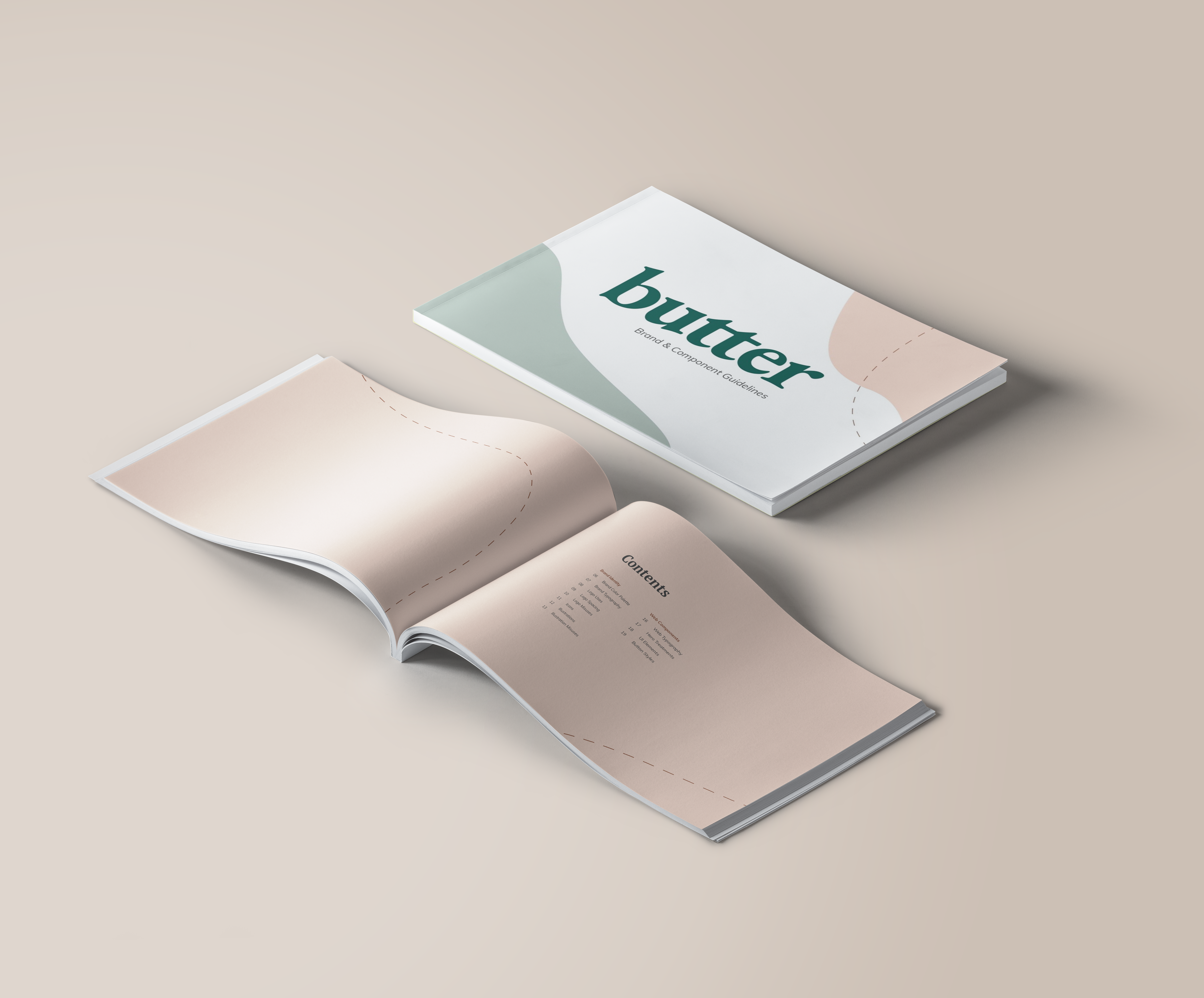
We launched the fully-functional Butter marketing site at the end of April 2019. We also completed a design system (brand guidelines and assets) for our client in order for future expansion with the development of a mobile app.